System Design
Product Design
UX Design

Problem
Trading dashboards make you pick a side: simple apps you outgrow, or dense apps that overwhelm you on day one.
Solution
OX, a dashboard that starts calm. You open it up when you want more, and it asks before it changes anything on its own. Trend and earnings context sit next to each ticker instead of inside a chart.
Process
Review mining → Pattern audit of 8 apps → 3 layout variants → Weighted scoring → Interviews and usability tests → Prototype built with Claude Code
Key features
"Trend" and "Earnings in" context on every watchlist row, not buried in the chart
Suggestions based on your habits, always asking before anything changes
Calm and Dense layouts, plus panels you can drag, hide, and bring back yourself
Outcomes
A full research arc in one month, from review mining to usability testing, kept moving by working with AI at each step
A design where the decisions trace back to something a participant did or said
A working prototype built with Claude Code, revised in minutes when testing showed something wasn't working
Teams are putting a working prototype up early with AI now, rather than starting from a written spec. I wanted to run a full project that way and document what happened. Most of my process so far has run through Figma, so this was also a chance to find out what changes when AI assists with the research and builds the prototype, and where I still have to step in and correct it.
For the subject, I picked something I run into most days. I use trading apps regularly, and the same small frustrations kept coming up. I had a hard time finding when a company was reporting earnings, and to see whether a stock was above or below its recent average, I had to open a chart and add an indicator.
I started with two inputs. First, I used AI to pull together recurring complaints about trading apps from reviews and forum threads. Then I ran a pattern audit of eight trading and fintech apps, seven of them through Mobbin's MCP connected to Claude Code, plus Webull, which wasn't in the library, audited live in the browser. Each one went through the same set of questions.
The eight were Public, Stake, Fidelity, Binance, Coinbase, Wealthsimple, Questrade and Webull. Robinhood isn't among them, since it's unavailable in Canada, so it stayed in the review reading rather than the audit. Binance and Coinbase were audited on their crypto surfaces, so they stand in for pattern comparison rather than as equities peers. I picked these eight to cover the range, from the simplest apps through to the most data-heavy, with two Canadian brokers for local context and Coinbase, which comes closest to serving both kinds of user in one product. Everything below describes them as they were when I looked in July 2026.
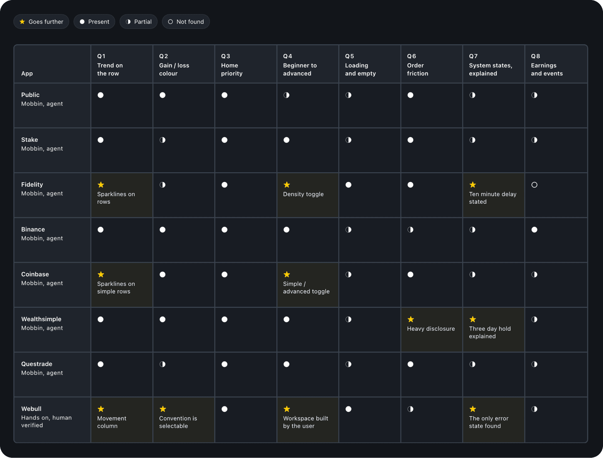
↑ The audit matrix. Eight apps, the same eight questions for each. Gaps read as not found in what I checked, not as absent
The research pushed back on my first assumption almost right away. I expected the main problem to be information overload. What I found was a split: the simple apps get outgrown, and the dense apps lose beginners. Most of the apps I looked at handle this by sending you somewhere else: a separate pro platform, a paid tier, or a mode you switch into. Coinbase's simple and advanced toggle is the smoothest version of this, since it keeps your funds and positions in place, but it's still a swap to a different front end rather than one screen adapting. Two apps do adapt in place, but only just: Fidelity lets you switch to a denser row, and Webull lets you assemble your own workspace out of panels. In that second case, the user does the adapting, which means the people most likely to need help are the least likely to get it.
That gave me a clearer question: how do I make one dashboard that suits both without splitting it in two? And underneath that, a second one: should the app adapt, or should the person adjust it?
The audit also confirmed the thing that started this project. Indicators and earnings dates both exist in these apps. They just live inside the chart. Webull even has earnings dates as a chart display toggle. Three of the eight put a small trend picture on the watchlist row, and the rest leave it at a percentage. Nowhere I looked does the row say what the trend means.
I ran the hands-on audit of Webull with Claude Code driving the browser through Playwright. It reported three findings as confirmed: no chart indicators, no theme setting, no earnings dates anywhere.
All three were wrong.
I spent five minutes in the app myself and found a full indicator library, a theme setting, and earnings data sitting in the chart settings. An agent failing to find something is not the same as that thing not existing.
That put a question mark over the rest of the audit. I had only checked one app by hand, and for the other seven I had screenshots and an agent's notes. So I changed how the findings were written. Where I hadn't looked myself, the note says the thing wasn't found in what I checked, rather than saying it isn't there. Those are two different claims, and only one of them is mine to make.
Two other useful things came out of it. I added a rule to the project: no "confirmed absent" claim gets used unless a human has checked it. And the theme settings page turned out to hold one of my favourite findings. The app lets you choose your colour convention, including red for up and green for down, which is the convention in several Asian markets. Green means up only until it doesn't. That turned my colour decision from a nice principle into a real requirement: gain and loss have to be swappable tokens.
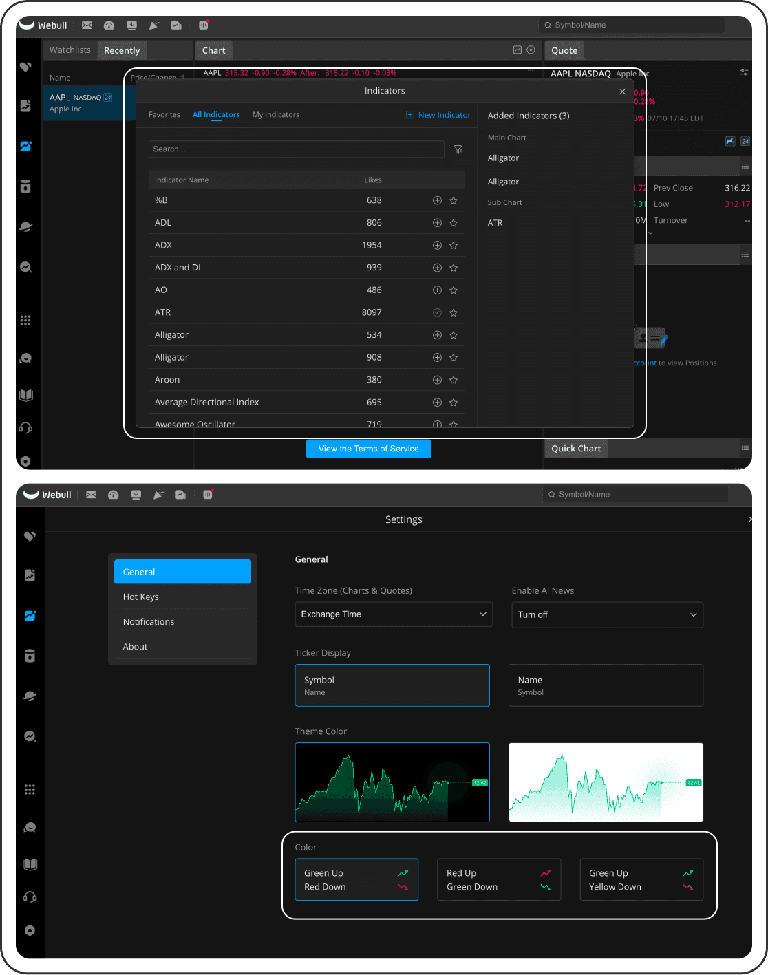
↑ The indicator library and colour convention settings I found by hand
I set the scoring criteria and their weights before generating any layouts, so I couldn't quietly tune them to favour a design I liked. Glanceability got the most weight, then cognitive load, then how well the layout grows with the user. Speed to place an order came last on purpose, because the research on overtrading made me wary of rewarding pure speed.
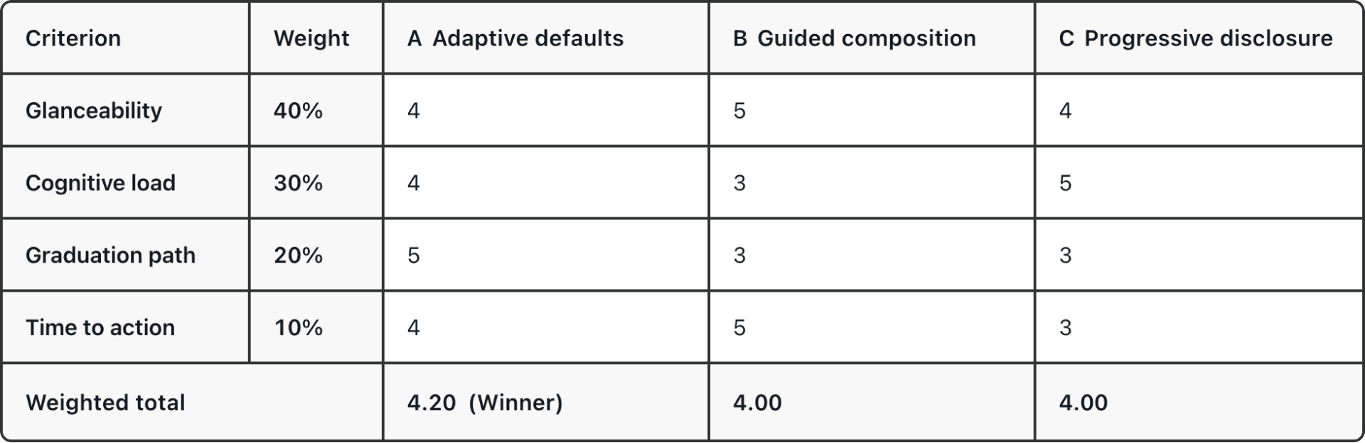
↑ The scorecard, with the weights that were set before any of the layouts existed
Then I generated three layouts that differ in one way: what happens when someone needs more than the calm view.
A – The system offers.
It notices habits and asks before changing anything.
B – You build it.
Starting layouts you pick from, with a panel library that opens up as you use it.
C – Nothing changes.
One fixed layout, where you open what you need in place, and the arrangement stays put.
I scored them, then had AI score them separately so I could compare. We agreed on eleven of twelve scores. The one gap was interesting: I had marked A lower on the "grows with you" criterion, and when I read my own reason for the score, it only said good things about it. I had marked it down so it wouldn't get too far ahead of the other two. That was me tidying the result, not measuring it. Once I fixed the score, A came out ahead.
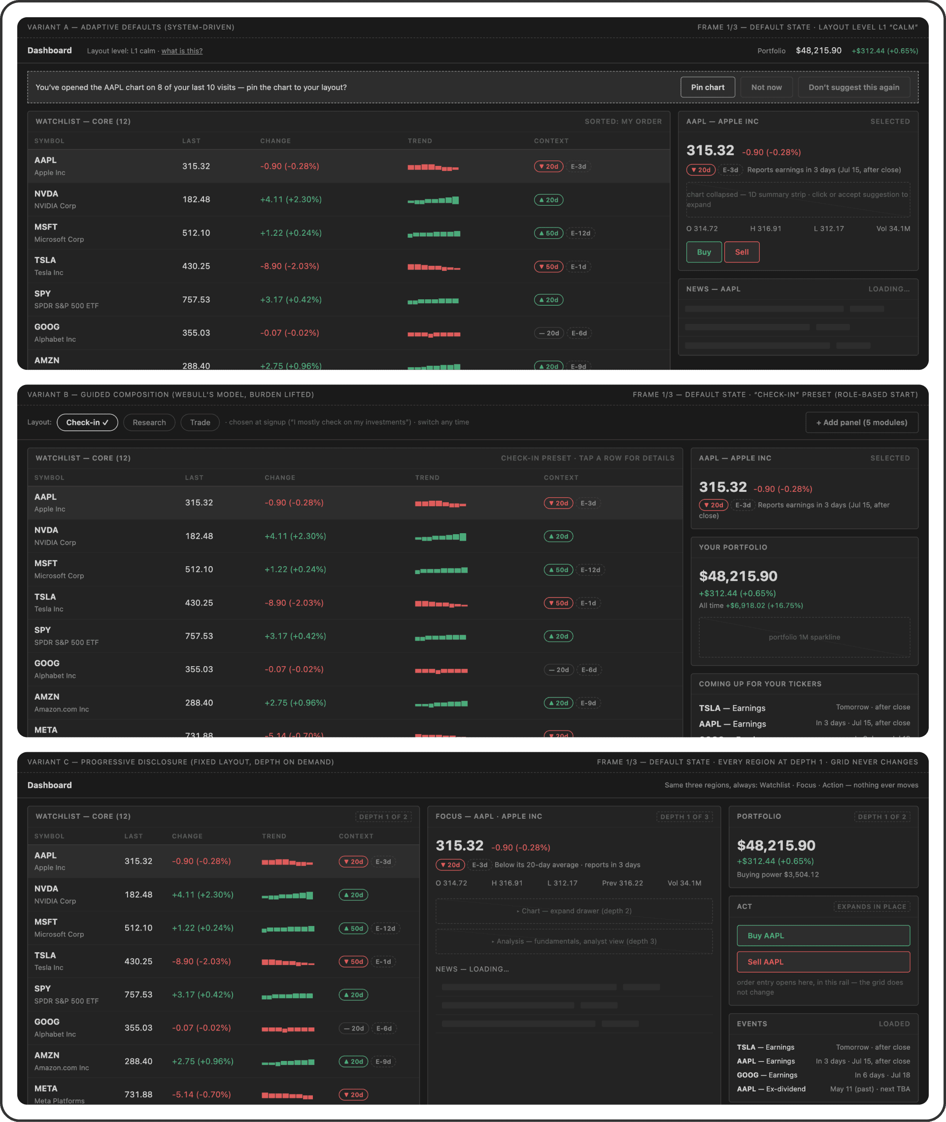
↑ The three variants at wireframe stage. Top to bottom: A, where the system offers; B, where you build it; C, where nothing moves
Two conversations, then two usability sessions on the prototype. Participant A trades actively and reads charts. Participant B checks in on a few holdings and rarely trades. One at each end of the spectrum I had been designing for. Two people is a small sample, so I treated it as a directional signal, not proof. I paid more attention to what they did than what they said.
Participant B read the trend marker as "down over the last 20 days" instead of "below its 20-day average", while Participant A read it correctly, and both needed help with the earnings marker. My signature idea only worked for people who already knew the language.
The fix turned out to be the wording rather than the explanation. During testing, neither participant had hovered over the marker to reveal the tooltip: Participant A didn't need it, and Participant B didn't know it was needed, having read the marker and moved on. A tooltip helps someone who knows they're unsure, and does much less for someone who is confidently wrong. So the trend marker now reads "▼ 20d avg", since an average is a line to sit above or below rather than a stretch of time, and the earnings marker became a spelled-out "Earnings in" column counting down in days. Both changes came after testing, so they haven't been in front of anyone yet.

↑ Left, as tested. Right, after. Nobody knew what "E-3d" meant, and "20d" got read as a stretch of time, so both got spelled out
Participant A told me in the interview that the fixed, full order review was the one to keep, for predictability. In the usability session, that step was skipped, and the condensed version went through without pause. That single moment settled a decision I'd been debating, and it's a clear reason I trust tasks over opinions in this project.
Participant A tried to drag a panel bigger. Participant B hid the news panel, liked that it could be brought back, and wished they could move sections around. Both had accepted the one suggestion on offer, so the winning idea bent rather than broke: OX keeps the suggestion engine and adds manual controls on top. My original thesis was that the system should carry the adaptation work. This round says people also want to carry some of it themselves.
Straight from the symbol to the stock panel, without reading a single column. That challenges the row-level idea for the calmer end of the spectrum, and it's still unresolved.
Participant A accepted the suggestion and then said not much had changed. I can't fully separate two readings of that: either the reward was thin, or the prototype didn't show the change clearly enough to notice. Both point the same way. The reward for the interruption was a chart getting bigger. So I changed what the suggestion does. It now offers to keep a stock you open often at the top of your watchlist: a smaller promise, easier to see when it happens, and it removes a bit of friction that comes back every visit. The mechanism was tested. This version of it hasn't been tested yet.
Calm is the starting point, and it stays that way until you change it. A first visit says so in plain words: your layout starts calm, nothing rearranges on its own, and the app asks first. You can also drag panels around yourself, a control added after both participants reached for it during testing.
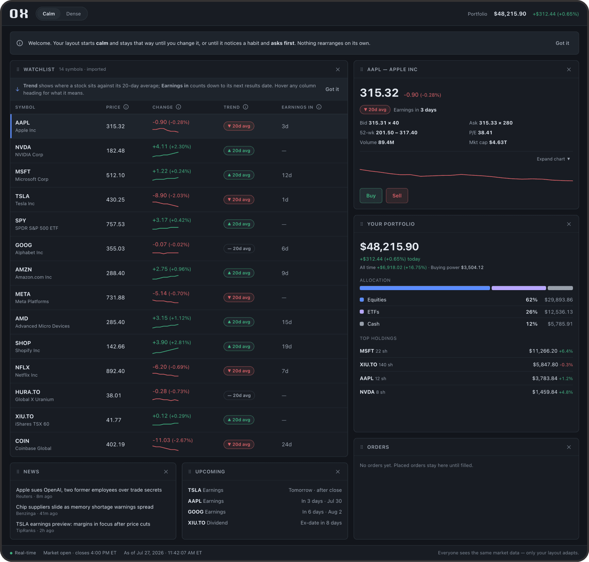
↑ A first visit, in Calm. The app has nothing to suggest yet, and says so
Suggestions come later, once there's a habit to notice. They appear as a single banner at the top: one per session, and a banner rather than a pop-up, which came up in the interviews as the format people find intrusive. "Not now" and "Don't suggest again" sit next to the accept button.
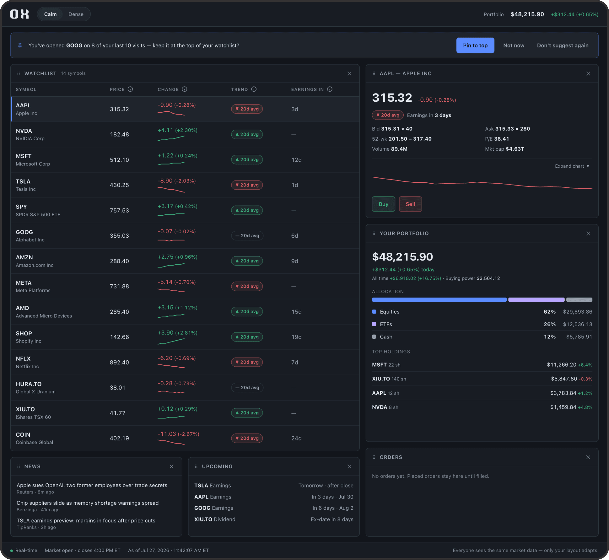
↑ A returning visit, in Calm. The app has noticed a habit and asks before acting on it
Calm and Dense are a switch, not a promotion. You pick one at any time, and the app doesn't move you between them. The suggestion engine still watches and asks, so the app can offer to help without needing you to switch to Dense at all. Dense just adds columns and opens the chart for anyone who wants to work that way.
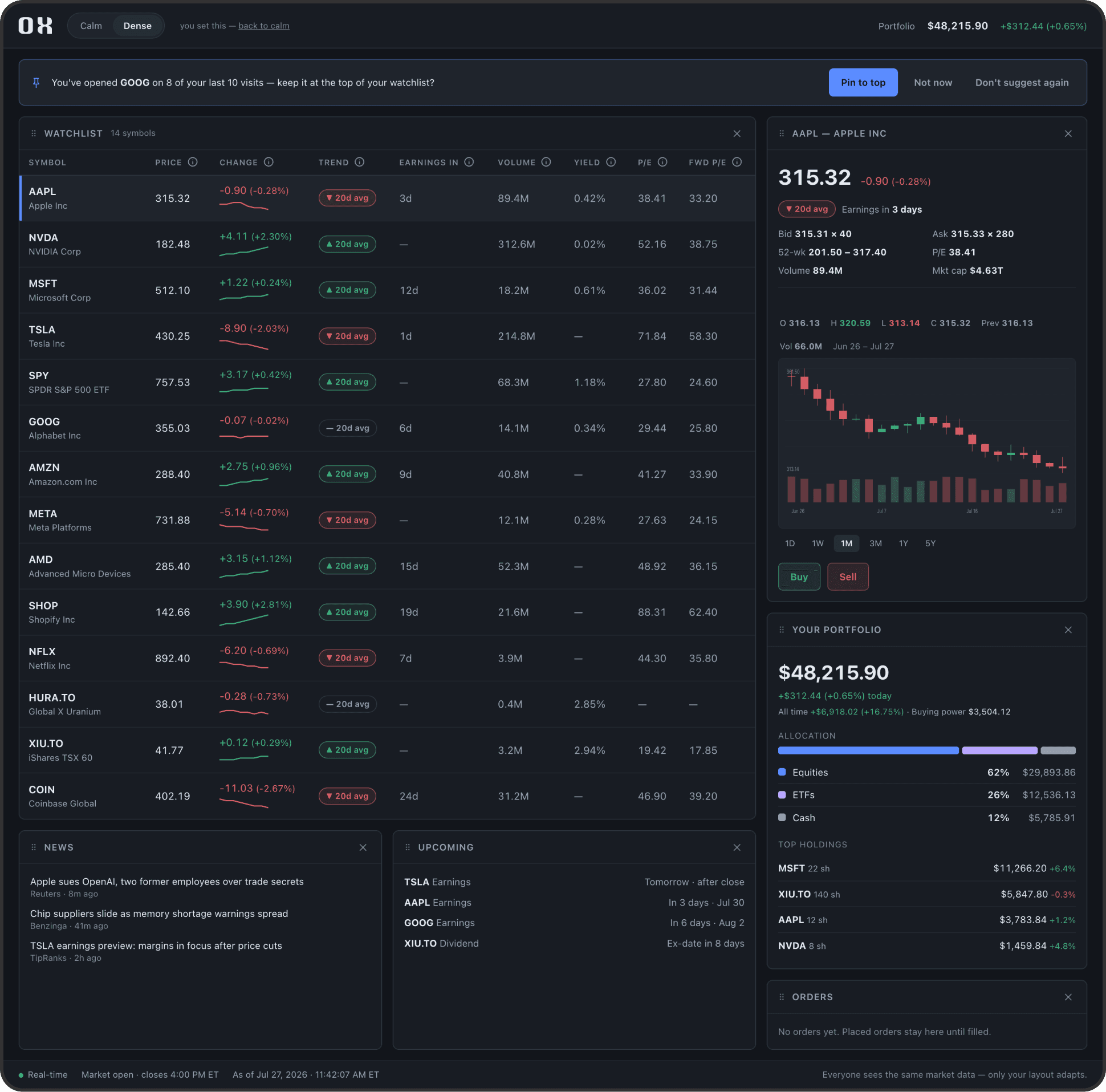
↑ The same returning visit, in Dense
The footer says the quiet part out loud: everyone sees the same market data, only your layout adapts. That line came from Participant A, who worried that an app watching their behaviour might treat them differently on price. It's a small piece of text doing a fairly big job.
"Trend" and "Earnings in" sit on the row, with the trend marker reading "20d avg" so it can't be mistaken for a time span, and a tooltip on each heading for anyone who wants the longer explanation. The trend markers all share the same 20-day period, keeping data consistent so the column can be scanned straight down. Orders stay visible in a panel until they fill, because a disappearing confirmation toast failed with both participants.
I scored the three layouts more than once. One pass gave all three top marks on my heaviest criterion, which turned out to be measuring something all three shared. Another marked a layout down so it wouldn't get too far ahead of the others. Both times it was working through it with Claude that uncovered the blind spot, since being asked why a score said what it said is harder to dodge than asking myself. Putting numbers in the cells was the quick part. Making sure each one said what I had actually seen took a lot longer.
Having seen prices change between accounts on a travel site, the worry carried over: if an app is paying attention to what I do, what else is it doing with what it learns? Explaining how the layout engine works doesn't answer that, because the worry isn't about layouts. It changed the design in two places. The app asks before it changes anything, and the footer states that everyone sees the same market data and only the layout adapts.
Both participants assumed anything on screen could be clicked. When something didn't respond, they couldn't tell whether they had misread the design or hit the edge of the build, and sorting that out took time I had set aside for the tasks. It also made pauses harder to read, since someone stopping might be thinking about the design or waiting to see if a click registered. A sentence at the start about which parts are live would have saved all of it.
Both started clicking the moment the screen appeared, before I had given them a task. I stopped them because I thought free clicking would affect the results. Looking back, I'm not sure that was the right call. Where someone goes unprompted says something a task can't, and I could have let it run for a minute and noted what they reached for first.
It compressed weeks into days and allowed for same-day prototype fixes, but it also missed three key details. That said, it caught two of my own errors by challenging why a score was given.
Most of the gaps in my matrix sit in apps I never opened at all. Mobbin holds selected screens rather than whole products, so a state can exist without being there, and an agent searching those screens can miss what actually exists in the live product. That's why every gap in the matrix reads as "not found" rather than "absent", and why the claims that mattered most came from the ones I checked myself.
Setting scoring weights before reviewing layouts stopped personal bias from picking favourites. Writing down a reason for every score forced clear explanations, making weak logic easy to spot and fix.
What people said in interviews didn't match what they did during tasks. Seeing that gap provided some of the clearest direction for improving the design.
Making labels compact often makes them hard to understand. People who misread a label won't hover over it for help, so adding one clear word directly to the label worked much better than relying on a tooltip.
For this pass, Mobbin helped with the audit, Claude Code handled the prototype, and personal judgment guided the scoring. Trying a different mix of tools, or running this again in a few months as the technology evolves, might reveal different insights. It is less about finding a single ideal method and more about what suited this specific project in the moment.
The logo was inspired by this ox at Toronto’s High Park Zoo. I tweaked the letter "X" to match its horns, placing the downward curve on the left and the upward curve on the right. Reading it from left to right makes the shape feel like a rising market, creating a positive overall feeling.

↑ The ox at High Park Zoo and the OX logo
Everyone I tested had seen the project before, so the open questions need a fresh reader: does the trend marker explain itself, does the first visit make sense, and is the new suggestion worth the interruption?
Building out a full design system with a component library and proper design tokens was out of scope for this project. If I take the project further, I will use Claude Code with the Figma MCP integration to speed up the process.