
Token System Design
System Design
Product Design

Problem
To support product expansion, the platform required a standardized framework to ensure visual consistency and accelerate the design-to-build pipeline.
Solution
Architected a scalable design system using a shadcn/ui foundation, 3-tier token structure, and OKLCH colour logic to support light and dark mode switching.
Process
UI audit → Token architecture → Component library → Page implementation
Key Features
Scalable tokens: A hierarchy of primitive, semantic, and component-specific tokens
Modern colour: OKLCH-based palettes for automated accessibility and P3 gamut
Dual themes: Native support for light and dark modes
Reusable components: Leveraged shadcn/ui to architect a library of custom UI elements optimized for complex workflows
Outcomes
Significantly reduced prototyping time for new features
Achieved a cohesive look and feel across the entire software platform
Established a shared "design token" language that simplified engineering handoffs
As Surpass EDI grew, the platform needed a solid foundation to keep the design consistent and help the team move faster. Working as the solo designer, the goal was to create a "single source of truth" for the entire product. By applying an Atomic Design method powered by a 3-tier token system, the project provided a clear set of rules and components that simplified the design-to-build process and prepared the software for future updates.
I created a 3-tier token system:
Tier 1 (primitive): Basic values like raw colours and font sizes.
Tier 2 (semantic): Giving values a purpose (e.g. colour/background).
Tier 3 (component-specific): Specific settings for things like buttons or input fields.
To save time, I used shadcn/ui as a base. It gave me a professional starting point so I could focus on building custom components specifically for our software’s unique workflow needs. I also used tools like Figma Console MCP to help me manage and update the components quickly.
I chose the OKLCH colour space. Unlike older systems, OKLCH matches how the human eye actually sees colour.
Easier accessibility: It makes it much simpler to check if there is enough contrast between text and backgrounds.
Vivid looks: It allows our app to use more vibrant colours (P3 gamut) while keeping everything consistent between light and dark modes.
I made sure every component followed WCAG guidelines. This ensures that our software is usable for everyone, regardless of how they interact with their screen.
The design tokens for Surpass EDI follow a clear, 3-tier structure to maintain consistency across the entire platform.
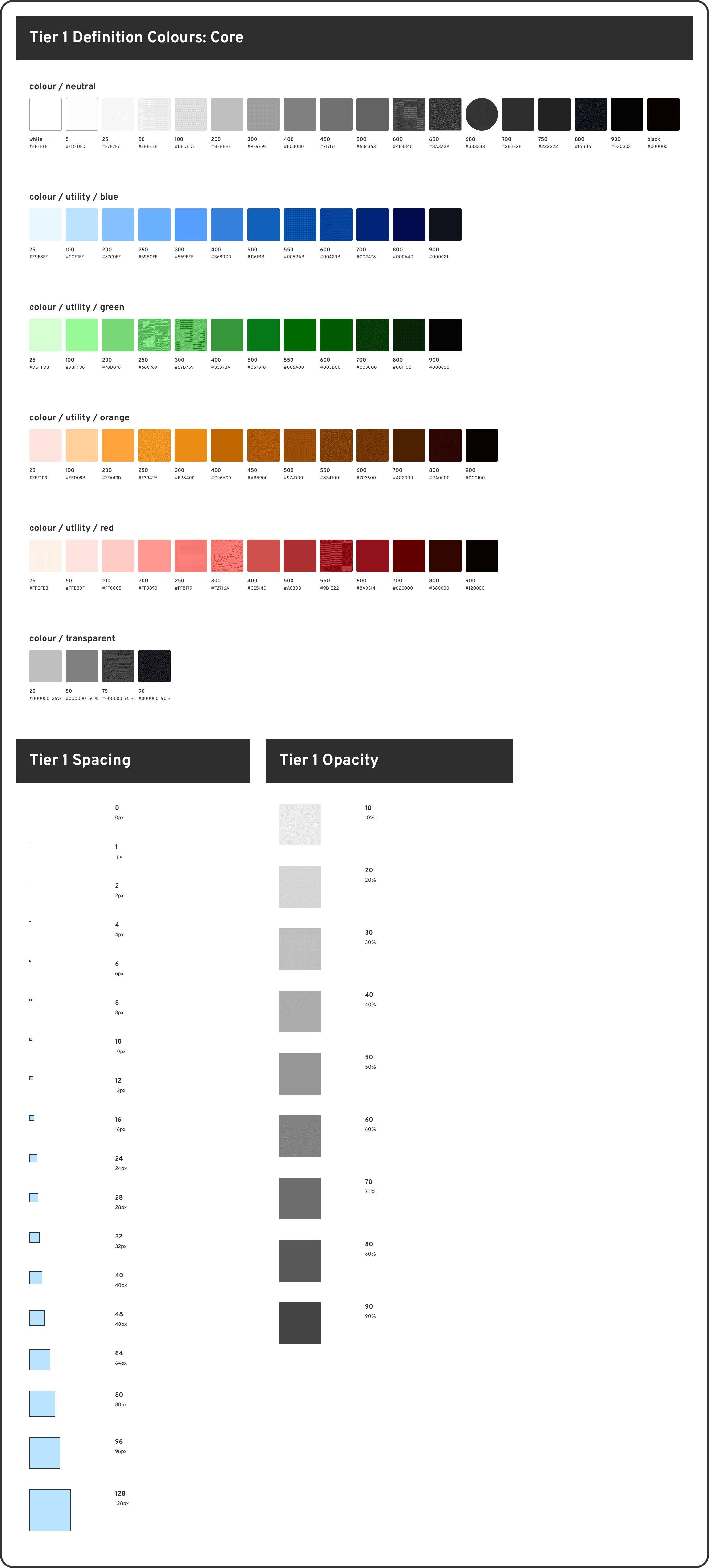
↑ Tier 1 primitive tokens: core
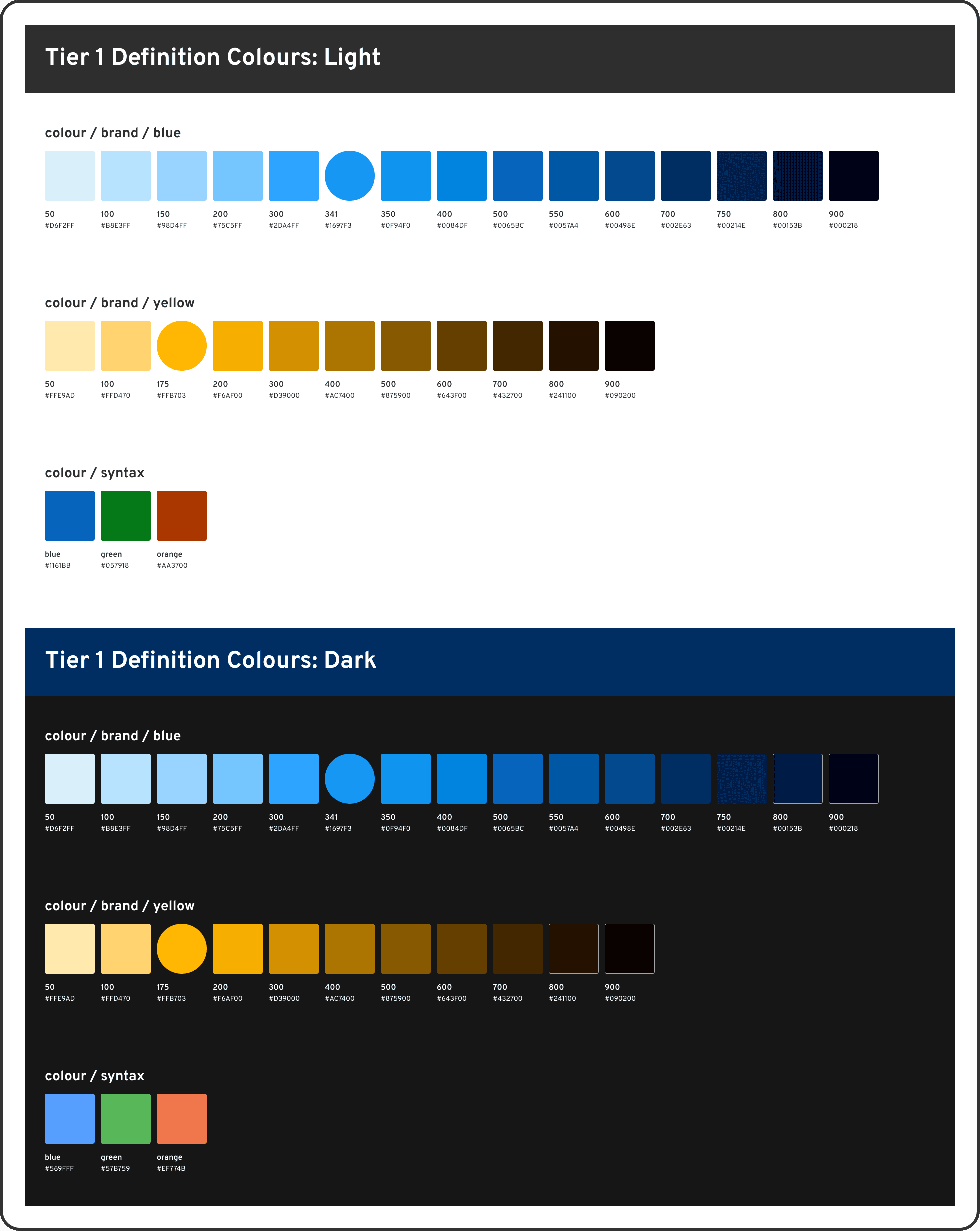
↑ Tier 1 primitive tokens: light and dark mode colours
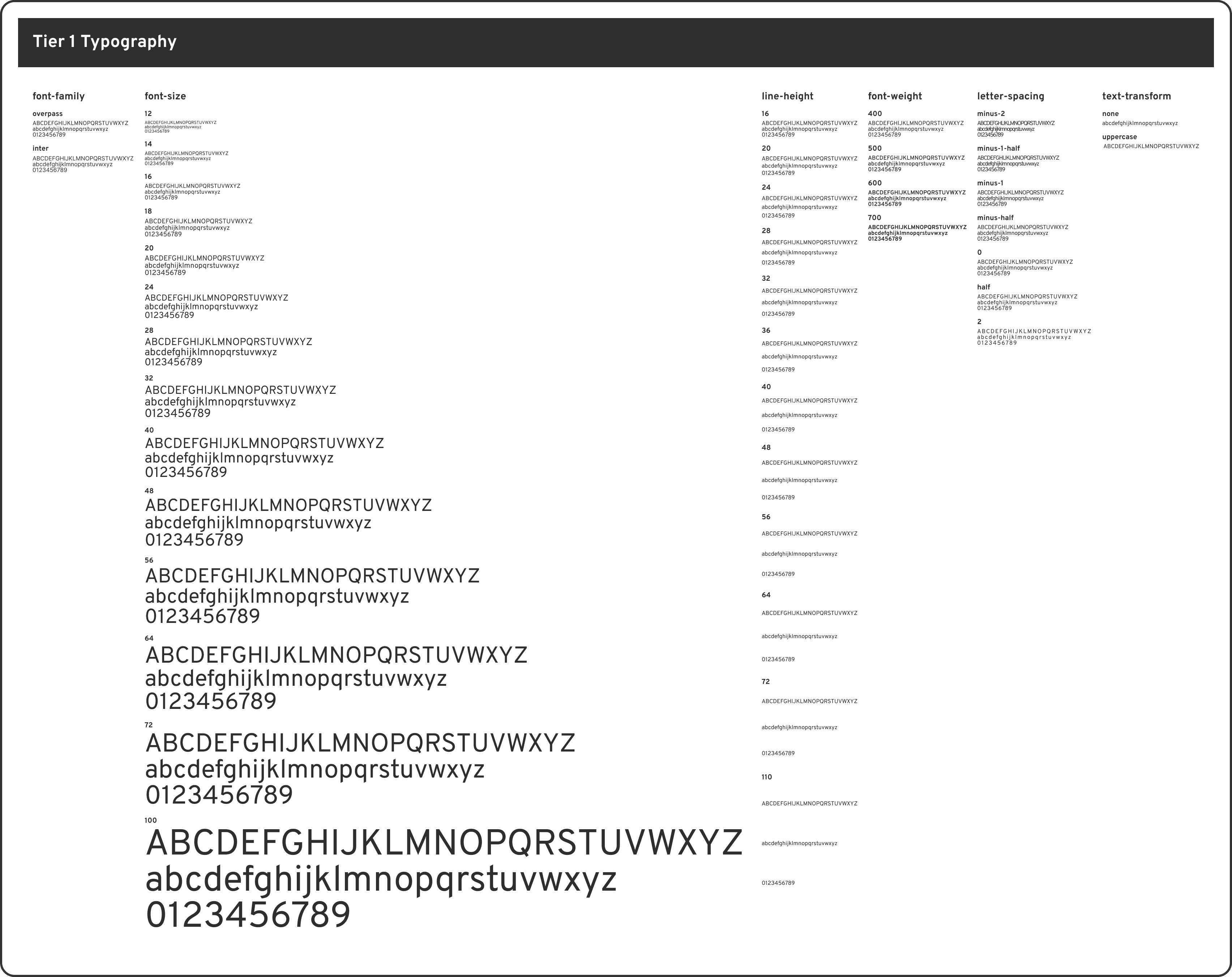
↑ Tier 1 primitive tokens: typography
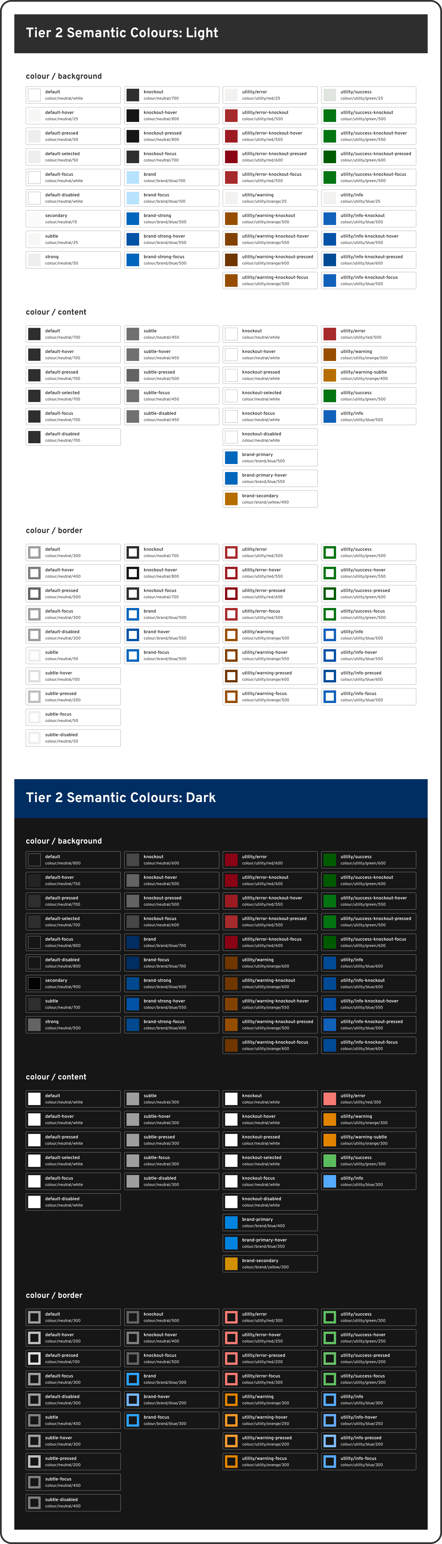
↑ Tier 2 semantic tokens: light and dark mode colours
↑ Tier 2 semantic tokens: typography
↑ Tier 3 component tokens: light mode colours
↑ Tier 3 component tokens: dark mode colours
↑ Tier 1 and Tier 2 border and stroke tokens
By using the token system, I built a library of flexible components that provide clear feedback and consistent interactions. These components are designed to be easily updated and reused across different parts of the software.
These cards allow users to track complex EDI processes at a glance. I designed them with distinct status colours and icons to communicate "complete," "in progress," and "alert" states clearly. They also include responsive variants for different device sizes to ensure the information remains legible everywhere.
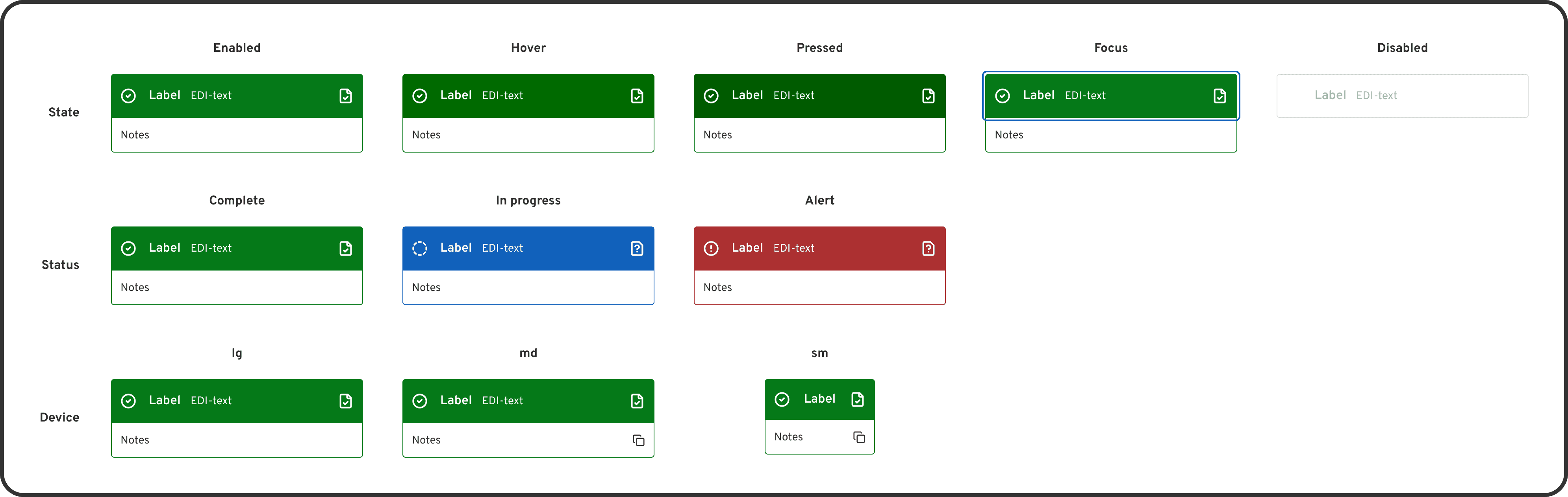
↑ Workflow card component
↑ Properties in the workflow card component
To ensure the interface is predictable, I developed a button system with 6 variants and 3 sizes. Each button supports a full range of interaction states including hover, pressed, focus, and disabled. I also included a loading state to provide immediate visual feedback during data processing.
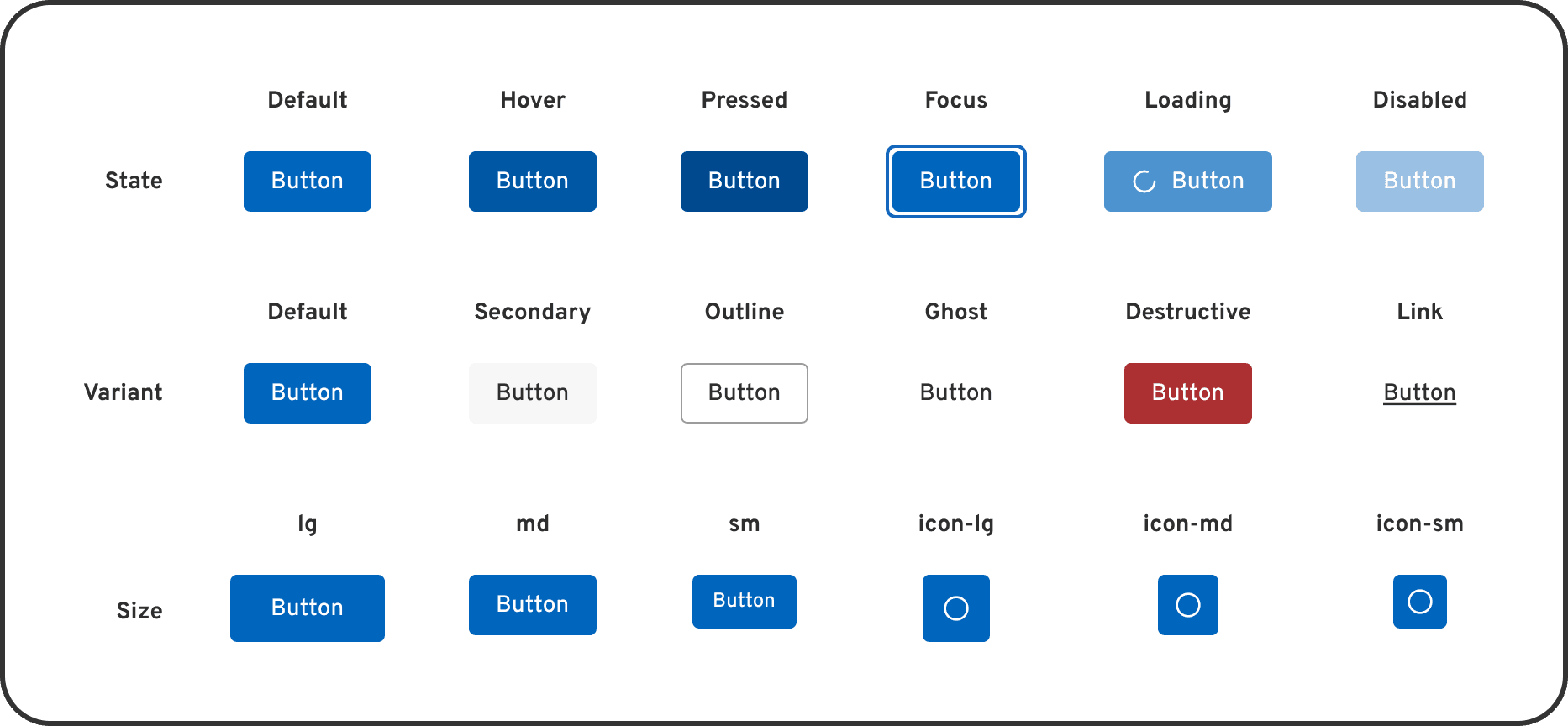
↑ Button component
↑ Properties in the button component
I created a flexible filter component to help users navigate large sets of transaction data. When a user selects options from the dropdown menu, the trigger transforms into a blue tag that displays the selection and a count for additional items. This design provides immediate confirmation of active filters and allows users to clear their selection with a single click.
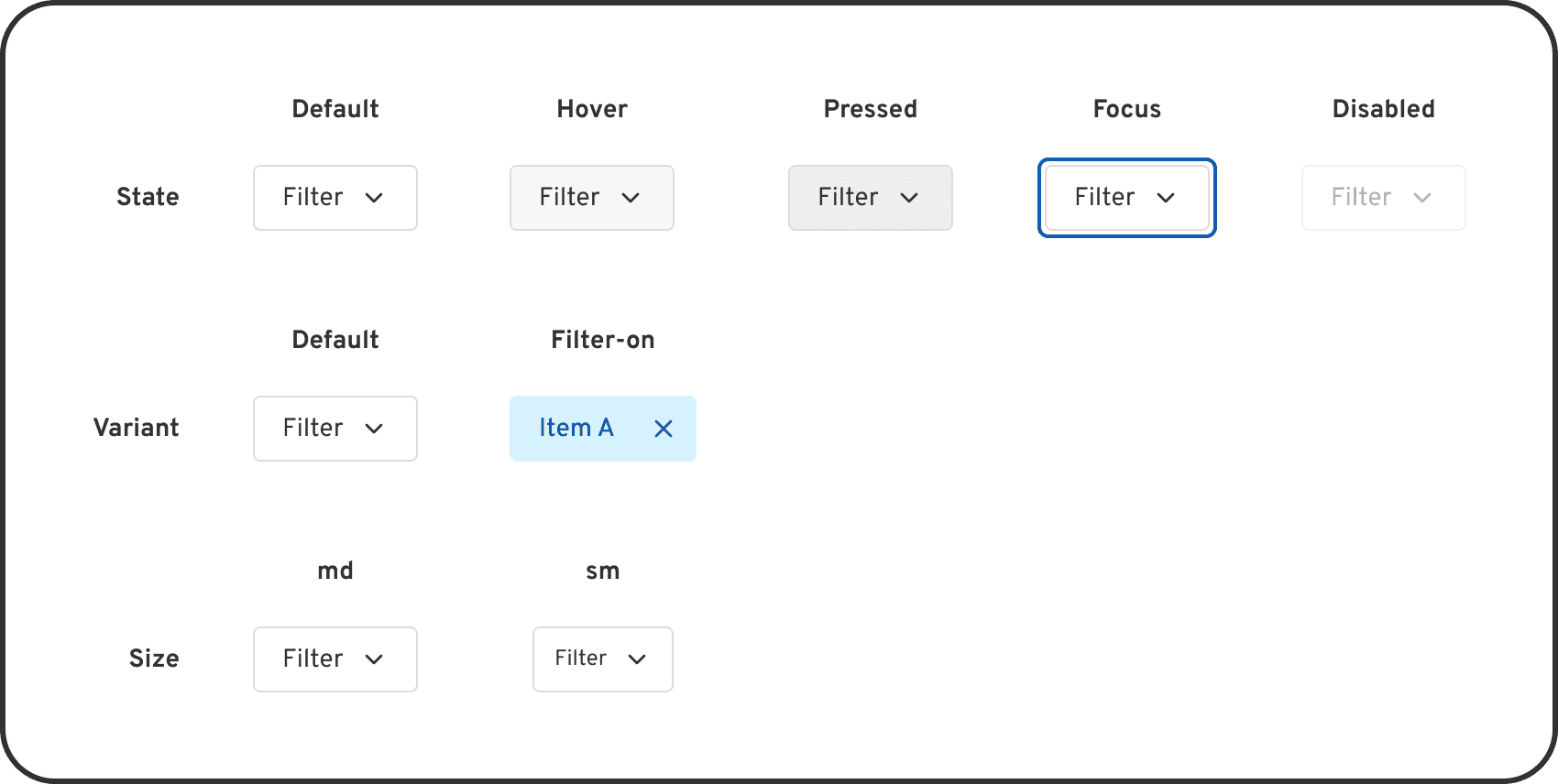
↑ Filter component
↑ Properties in the filter component
↑ Filter component demo
These core pages for Surpass EDI demonstrate the design system in action. By utilizing the established component library and 3-tier token architecture, the interface maintains a cohesive look and feel across both light and dark themes.
This page allows users to see and manage all transactions in one place. By using the table components and design tokens, I ensured that dense information remains readable and the hierarchy is clear. The system uses specific colour deltas to maintain accessibility standards in both light and dark modes.
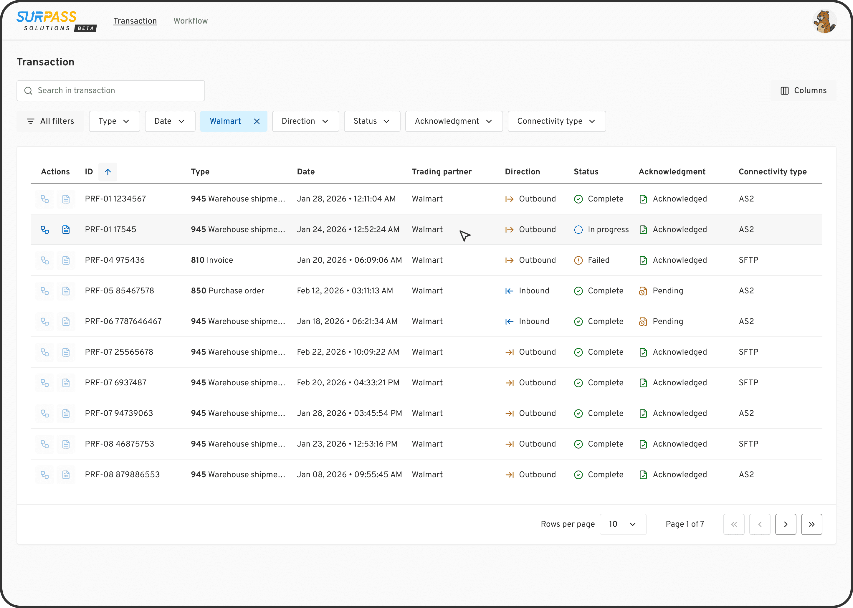
↑ Transaction table page in light mode
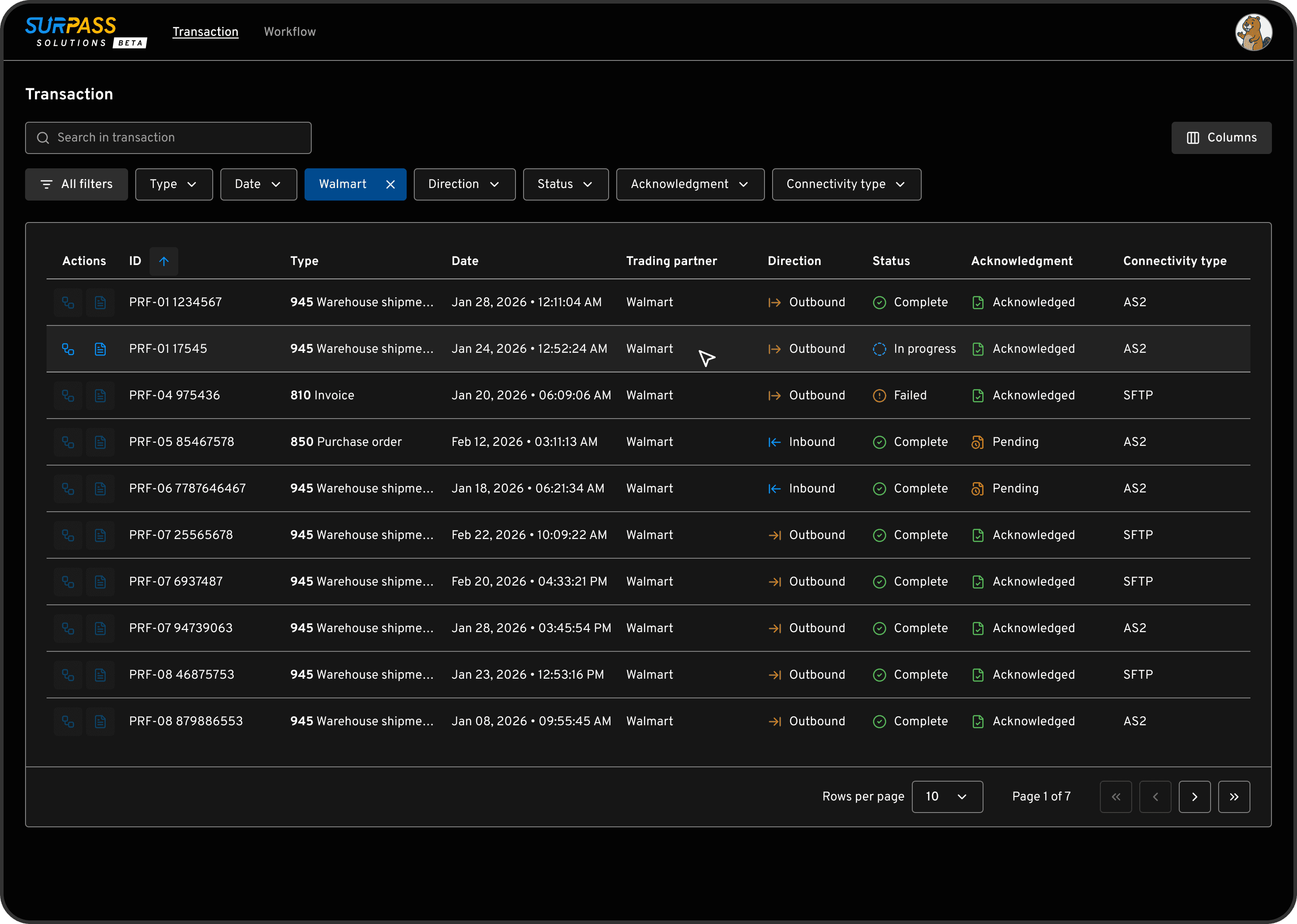
↑ Transaction table page in dark mode
This view allows users to track the entire document flow and status for a specific ID. The workflow cards visualize the relationship between entities like the retailer and 3PL providers. Standardizing these complex cards into the design system ensured that status colours (like "alert" red or "complete" green) remain vibrant and distinguishable across both themes.
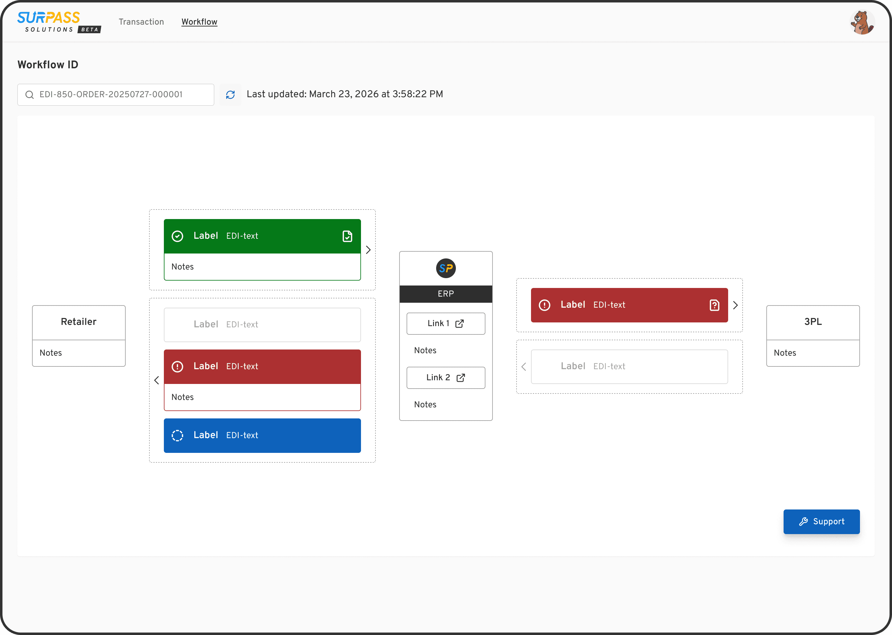
↑ Workflow ID page in light mode
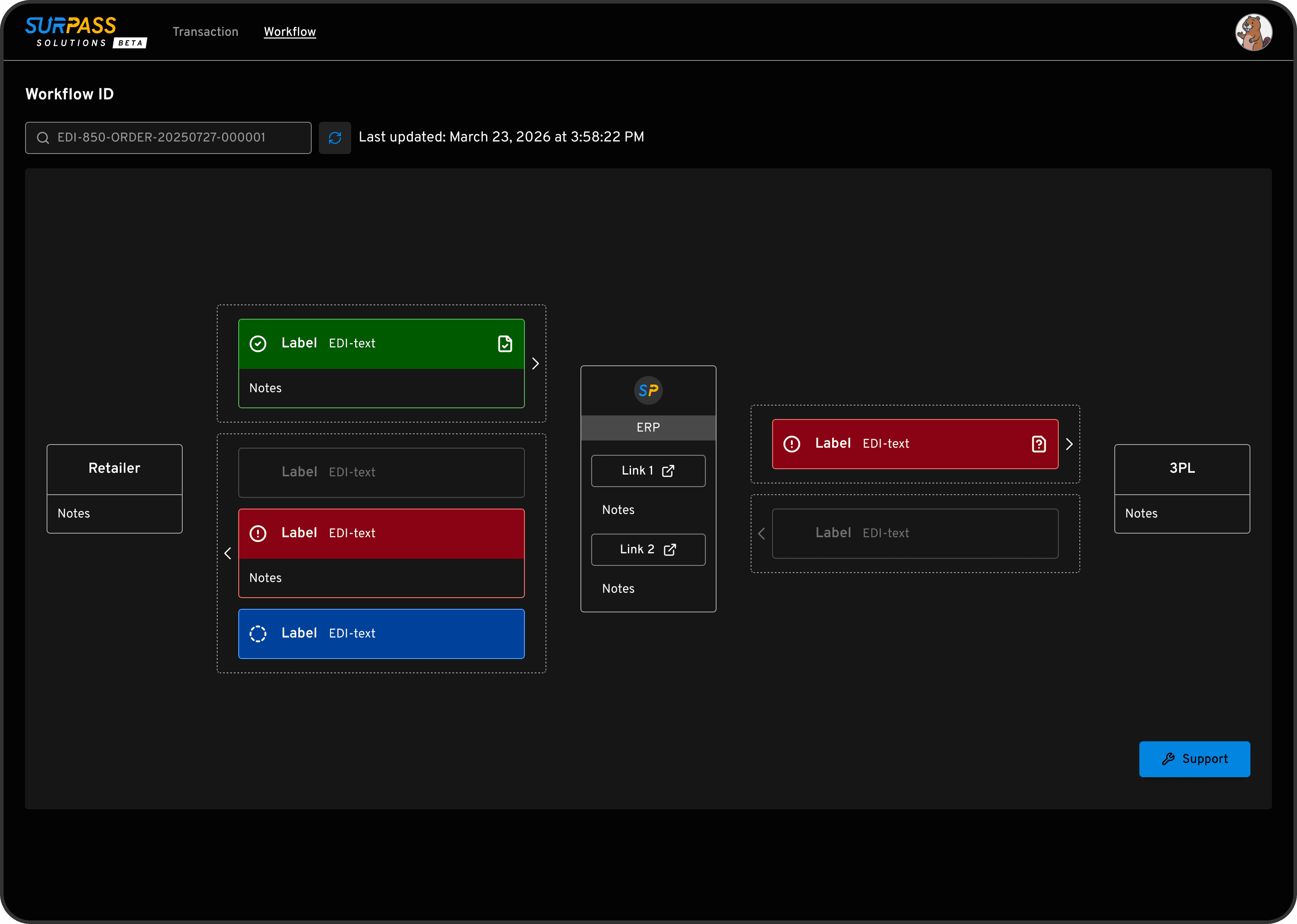
↑ Workflow ID page in dark mode
Even though I am the only designer on this project, I needed to ensure my components were flexible. I wanted to prevent "detaching" instances, which happens when a component is too rigid to fit a new need.
The solution: Components were engineered using advanced Figma properties (Boolean, Instance Swap, and Text) to maximize flexibility. By maintaining a modular architecture, the system is designed to scale alongside new Figma features like Slots, ensuring long-term adaptability for future designers without requiring a library rebuild.
One of the biggest risks in a design system is updating a shared token. If I changed a colour token, I had to ensure it didn't negatively impact other components using that same value.
The solution: I carefully audited every component before making global changes. If a specific component needed a unique look that didn't fit the global rule, I created component-specific tokens. This kept the system flexible without breaking the overall design.
I originally wanted to use transparent "overlays" for different button states (like hover or pressed) to keep the system simple. However, after talking with the engineers, I found out this would be very difficult for them to code.
The solution: I dropped the overlay idea and created specific tokens instead. It was more work for me in Figma, but it made the developers' lives much easier and the final product more reliable.
Since launching this system, the results have been clear:
I can now create new wireframes and prototypes much faster because the "building blocks" are already ready.
The software looks significantly more consistent and cohesive across all main pages.
The engineers find it much easier to build because the design components now match the code structure.
Starting with a collection of UI components doesn’t mean everything in it is useful, nor does it mean it has everything I need. To keep the design system manageable, I focused on only building the components we actually required. This prevented the system from becoming over-complicated and ensured it was easier for the team to maintain.
I learned how vital it is to stay in constant communication with the engineering team. Something that seems like a simple design tweak in Figma can sometimes be very difficult to implement in code. By syncing often, the design system achieved a balance of visual consistency and technical efficiency.
A design system is never "finished." As the software becomes more complex, the system needs to evolve with it. I also learned to embrace new tools to work more efficiently. For example, I use Claude Code with the Figma Console MCP to audit the system and Figma Make for rapid prototyping. Staying adaptable allows me to keep the system up-to-date as the industry changes.
I added our mascot, Eddie the beaver, into the system examples to add a bit of personality and delight for the team!

↑ Eddie the beaver
The design system is a living project that will grow alongside our software. Because we are currently working with limited resources, I focused on adding clear descriptions and visualising tokens directly within the Figma files for the team to use immediately.
Looking ahead, my goal is to build a dedicated documentation site. This would serve as a central hub for both designers and developers to access guidelines and code snippets. I am also exploring how to use AI tools to generate this documentation more efficiently, ensuring the system remains easy to maintain as the team and product scale.


