
System Design
System Design
Product Design

Problem
AI chatbots lack personality; design systems need better scalability for rebrands.
Solution
Built a flexible 3-tier token architecture with 4 weather-themed modes that adapt automatically.
Process
System architecture → Token creation → Component building → Testing & refinement
Key Features
4 dynamic themes: Vanilla Sky (default), Sunny, Rainy, Nighty (dark mode)
3-tier token structure: Primitive → Semantic → Component-specific
Responsive across 3 breakpoints with automatic typography scaling
Outcomes
Complete design token system built with Figma variables
Scalable foundation ready for team collaboration and future development
Demonstrated mastery of systematic design thinking
Accessible colour combinations meeting contrast requirements
After taking an interesting design token course, I became fascinated with how design tokens work in Figma. I wanted to build my own system from scratch to really understand the process. I chose to create a fictional AI chatbot as my example because I noticed that most current AI chatbots look pretty similar—I thought they could use more personality.
I applied everything I learned from the course to create a design token system that can easily adapt to different themes and screen sizes. Every design token in this project was built using Figma variables, making the whole system flexible and scalable.
Having worked through several company rebrands, I know firsthand how much work goes into brand refresh projects. A well-built design token system can be a lifesaver in these situations, so I wanted to create something easy to adapt and maintain.
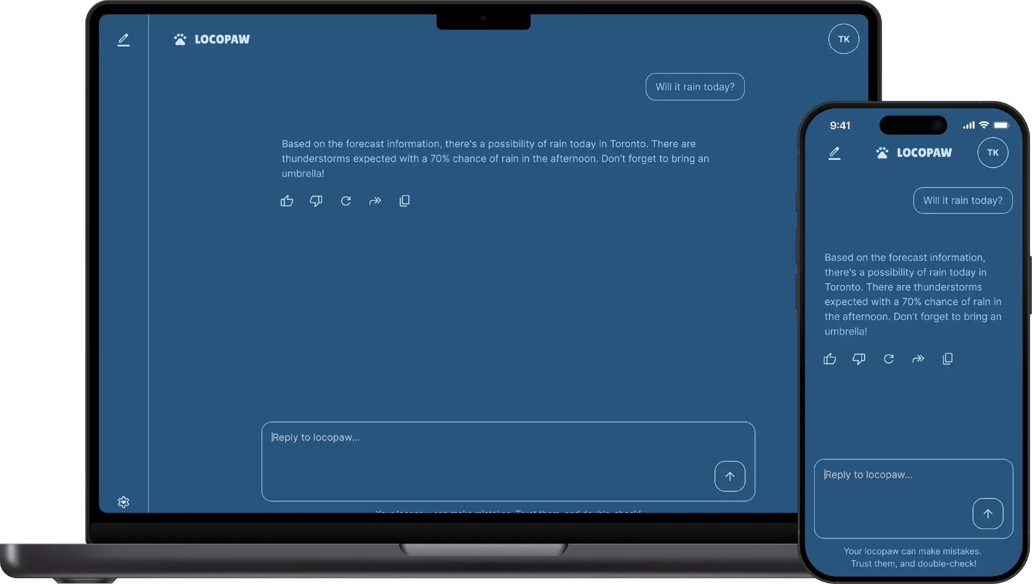
I named this AI chatbot Locopaw, inspired by Houtong, a charming town in Taiwan famous for its local cats. These cats know exactly where to find the coziest spots and where tourists will feed them. I always thought if they could talk, they’d be the perfect local guides—answering all your random questions and sharing hidden gems in the area.
As someone who loves travelling, I’d find an AI chatbot like this incredibly helpful for exploring new places. One question I always ask wherever I go is “What’s the weather like?”—and that’s exactly what inspired me to develop these four distinct design modes: Vanilla Sky (the default), Sunny, Rainy, and Nighty (dark mode). Each mode captures a different atmospheric mood and can either be set manually by users or automatically sync with the current weather conditions.
To speed up the process (and embrace the AI theme), I used AI chatbots to help with typography and colour suggestions. Most of their recommendations were spot-on and really streamlined my workflow, though I still needed to put on my designer hat to fine-tune some choices along the way.
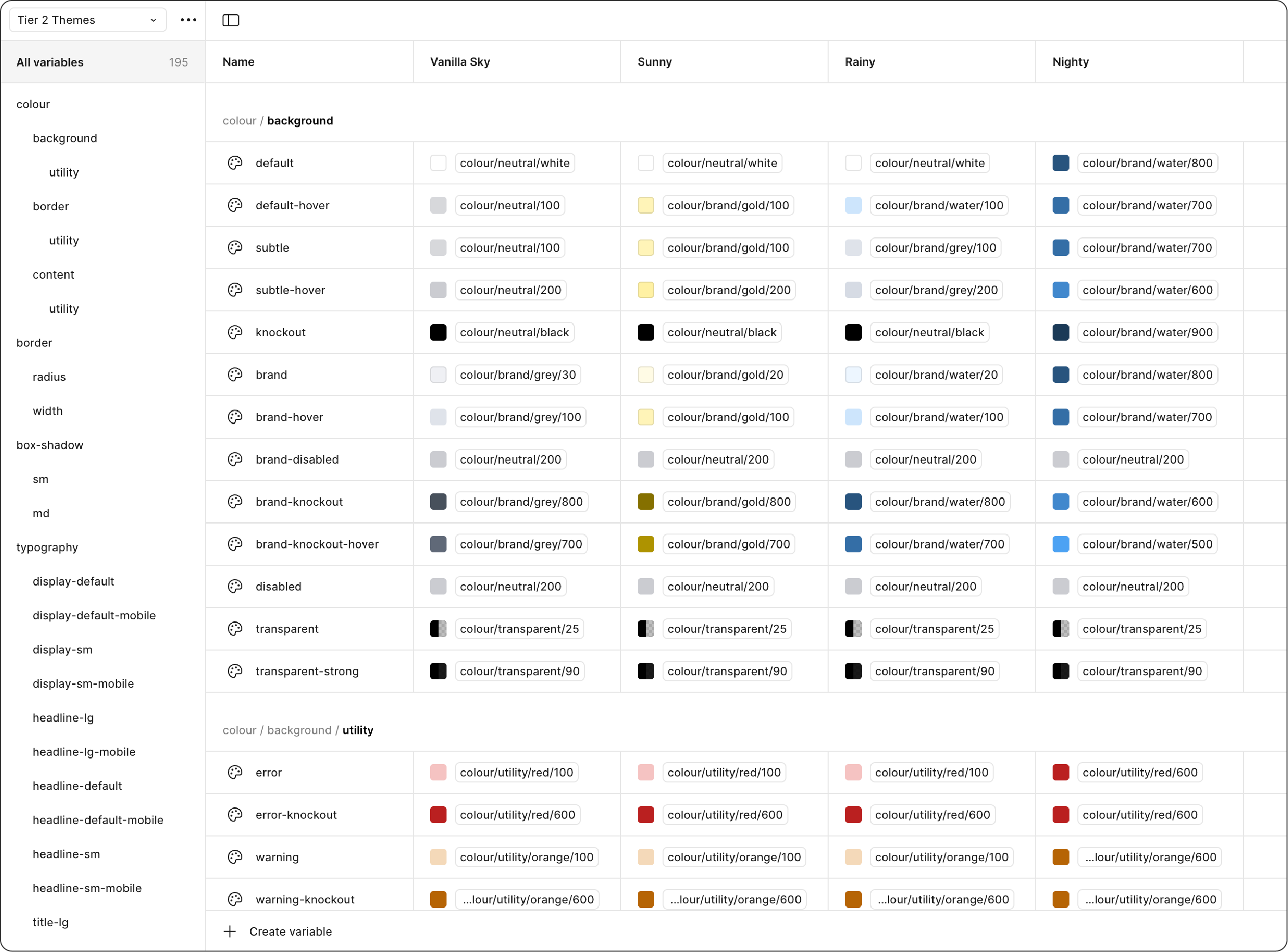
I built this system using a 3-tier token architecture to make it more dynamic and flexible in Figma:
• Tier 1 tokens (primitive tokens) are the foundation—basic elements like colours and spacing
• Tier 2 tokens (semantic tokens) connect to Tier 1 for specific purposes and meanings
• Tier 3 tokens (component-specific tokens) are used for certain elements, such as buttons and forms. These tokens give components the flexibility to look different when the situation calls for it, while still maintaining overall consistency.
I created 5 collections for Tier 1: Core, Vanilla Sky, Sunny, Rainy, and Nighty. The Core collection holds non-branded elements like spacing, neutral colours, and utility colours. The other four collections contain brand-specific styles, including borders, brand colours, shadows, and typography.
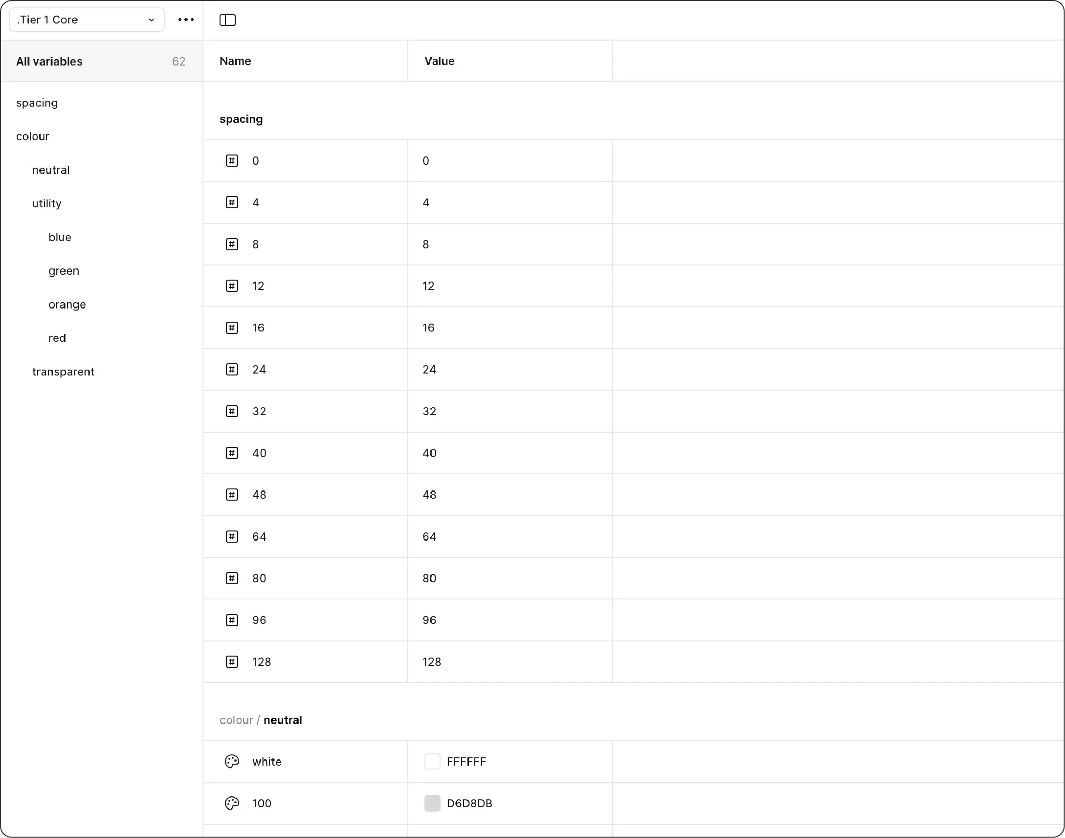
↑ Tier 1 primitive tokens: Core
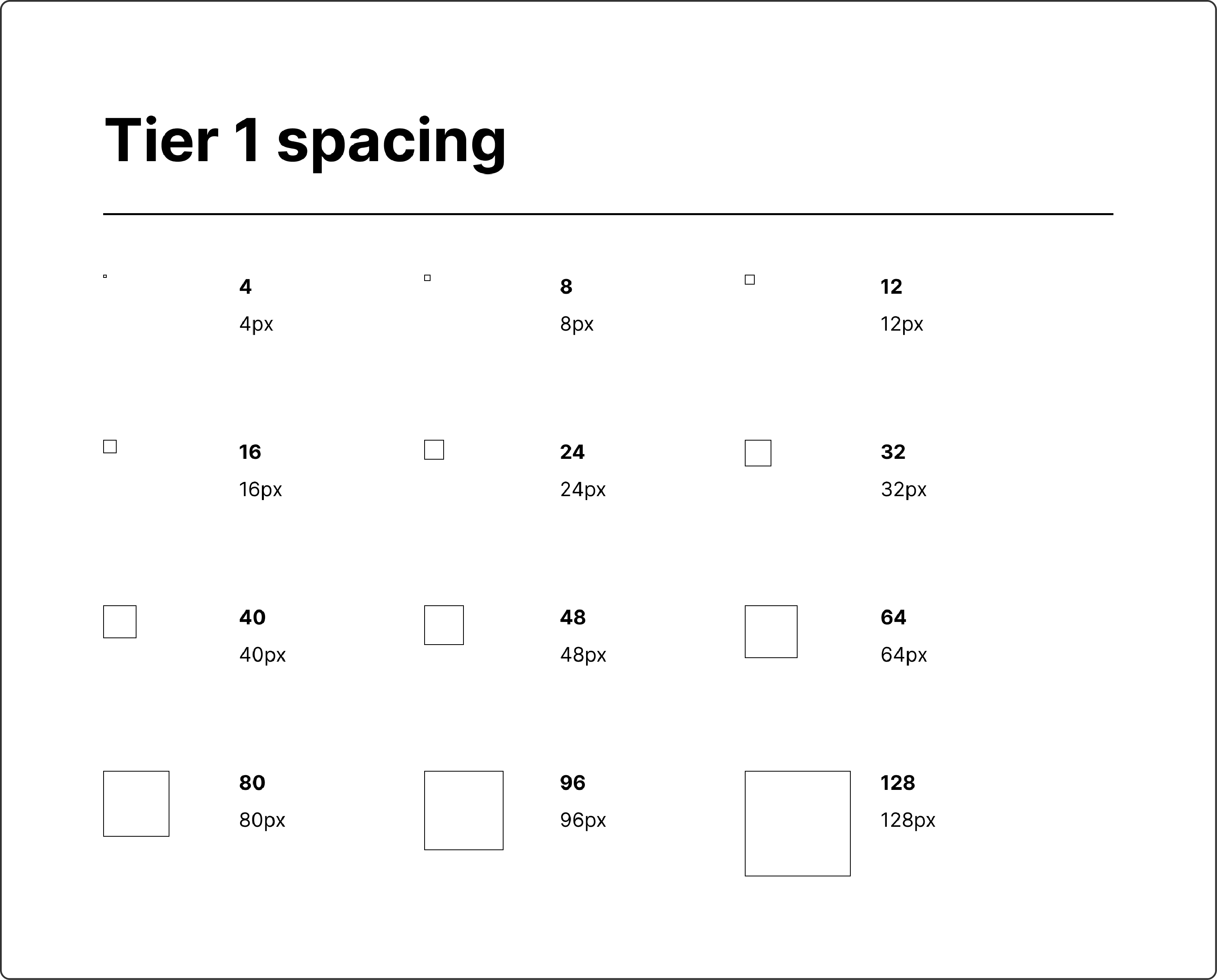
↑ Tier 1 primitive tokens: Core spacing values
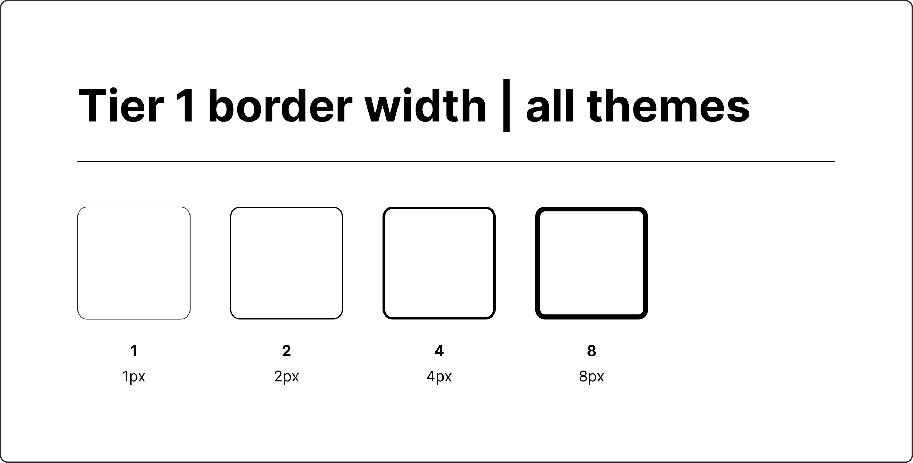
↑ Tier 1 primitive tokens: Core border width values
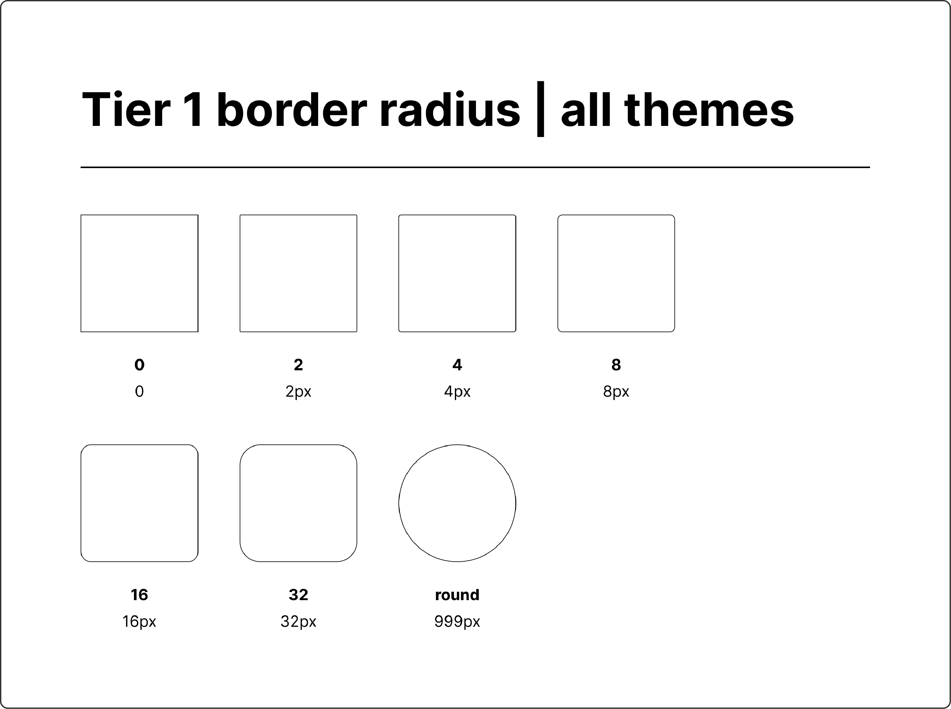
↑ Tier 1 primitive tokens: Core border radius values
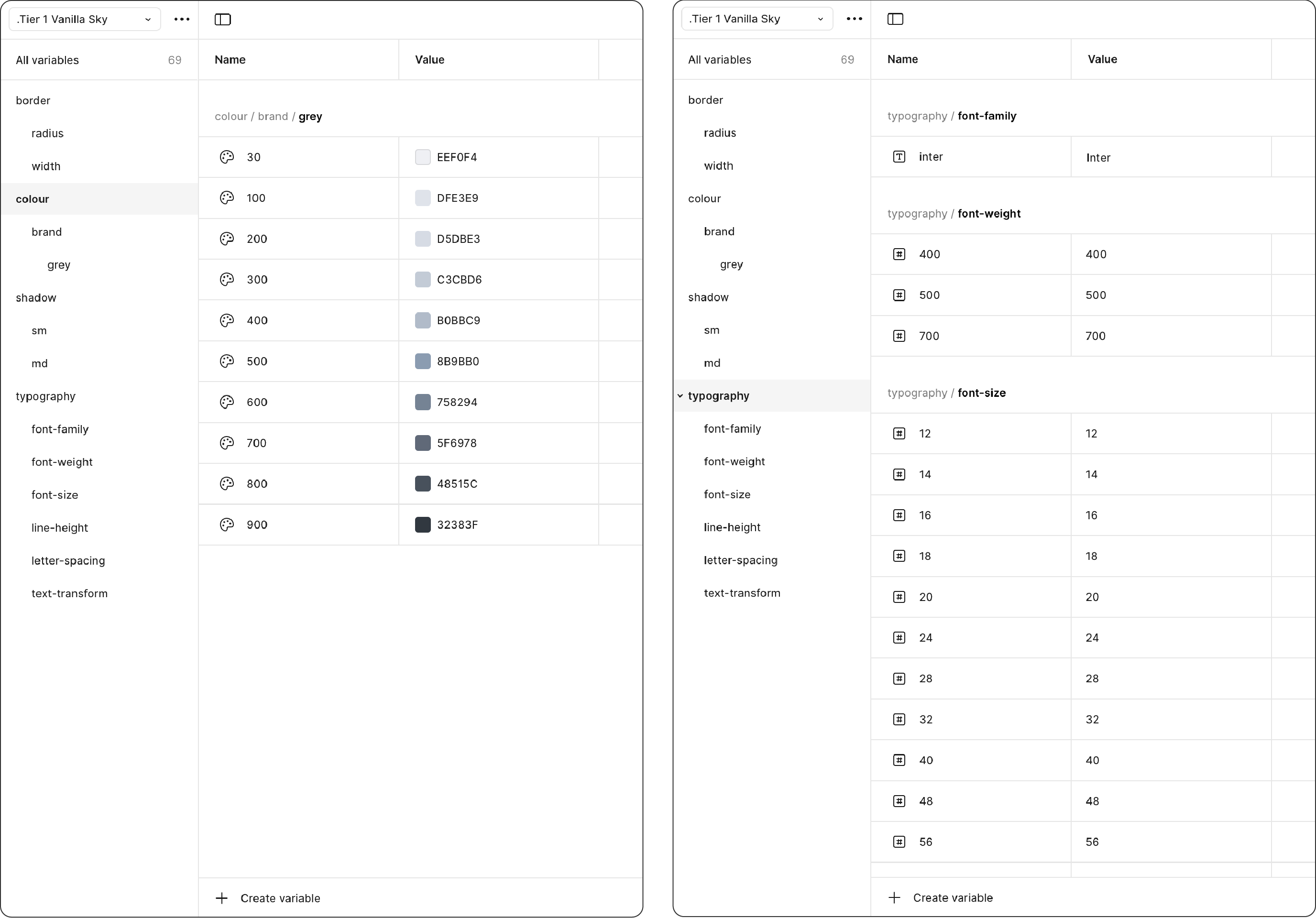
↑ Tier 1 primitive tokens: Vanilla Sky theme
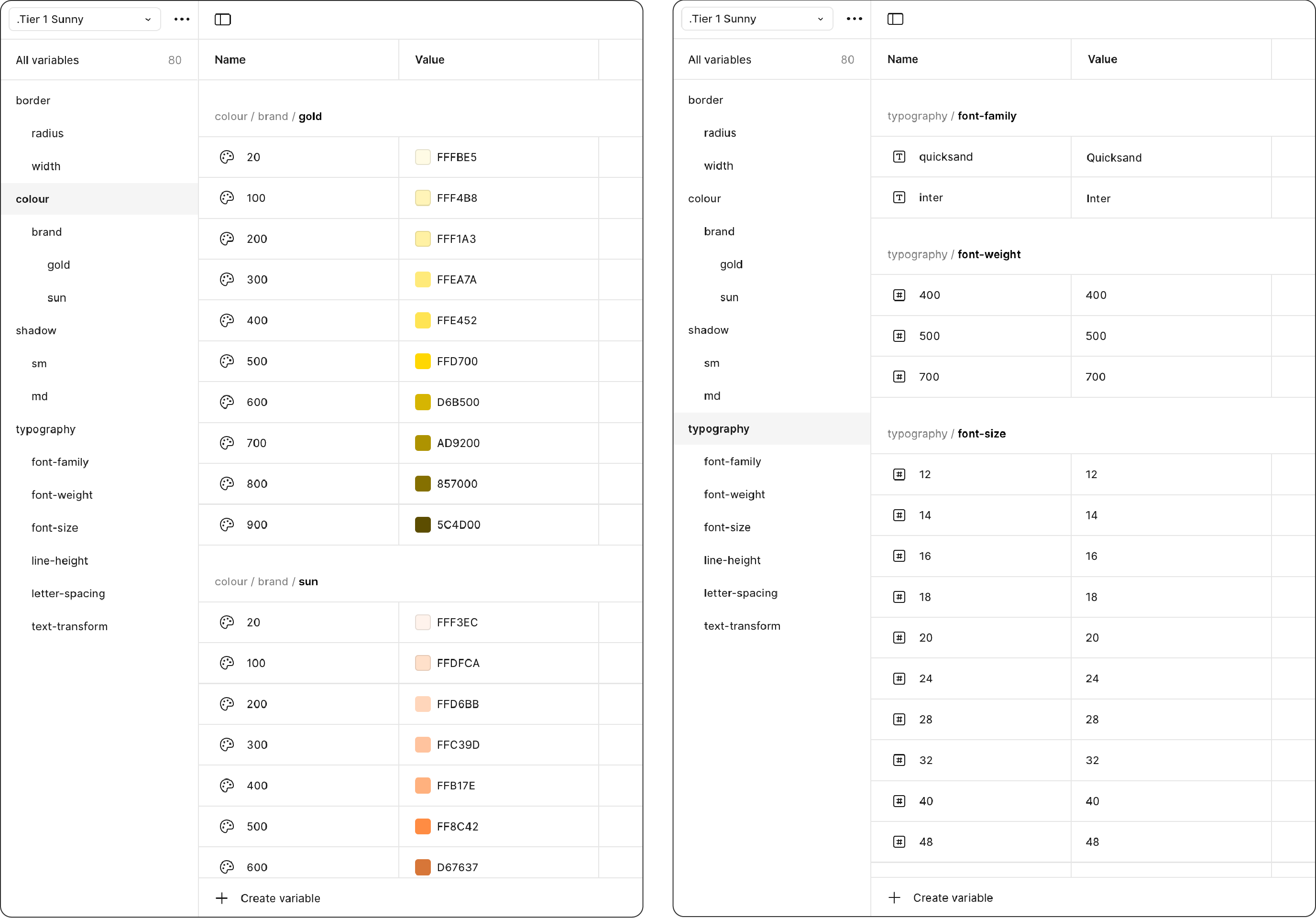
↑ Tier 1 primitive tokens: Sunny theme
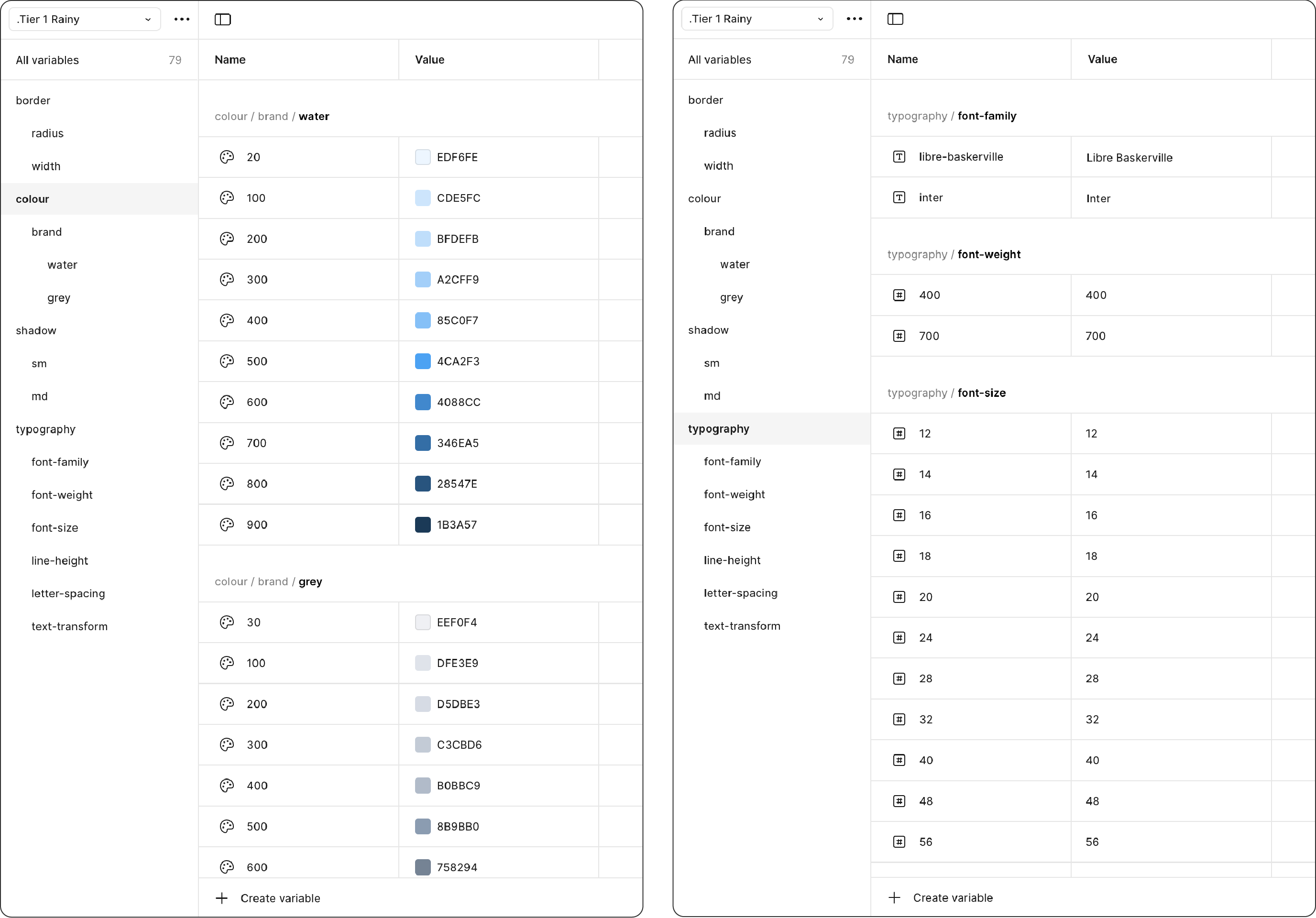
↑ Tier 1 primitive tokens: Rainy theme
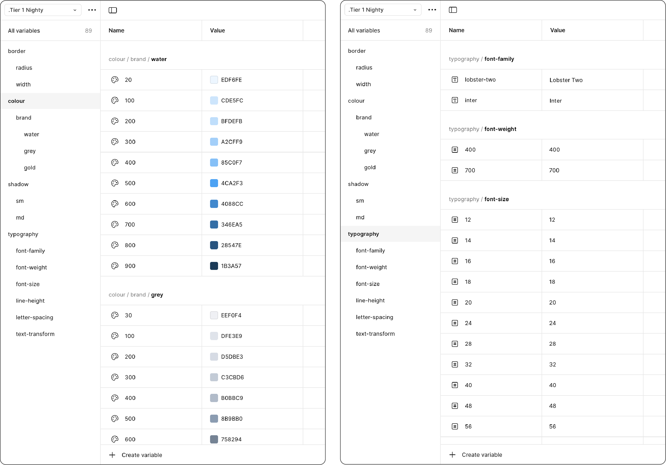
↑ Tier 1 primitive tokens: Nighty theme
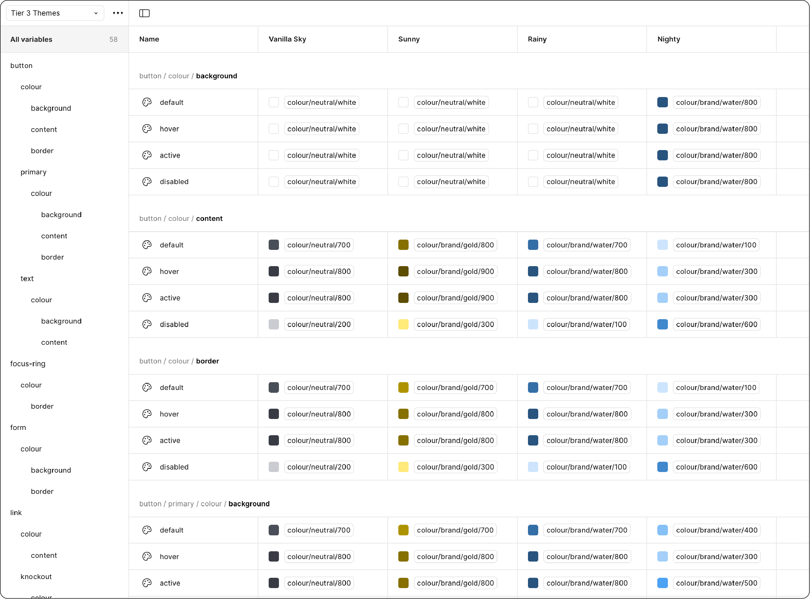
This collection maps all the Tier 1 themes together, covering colours, border styles, shadows, and typography. Each of our four themes becomes a mode within this collection.
↑ Tier 2 semantic tokens: colours
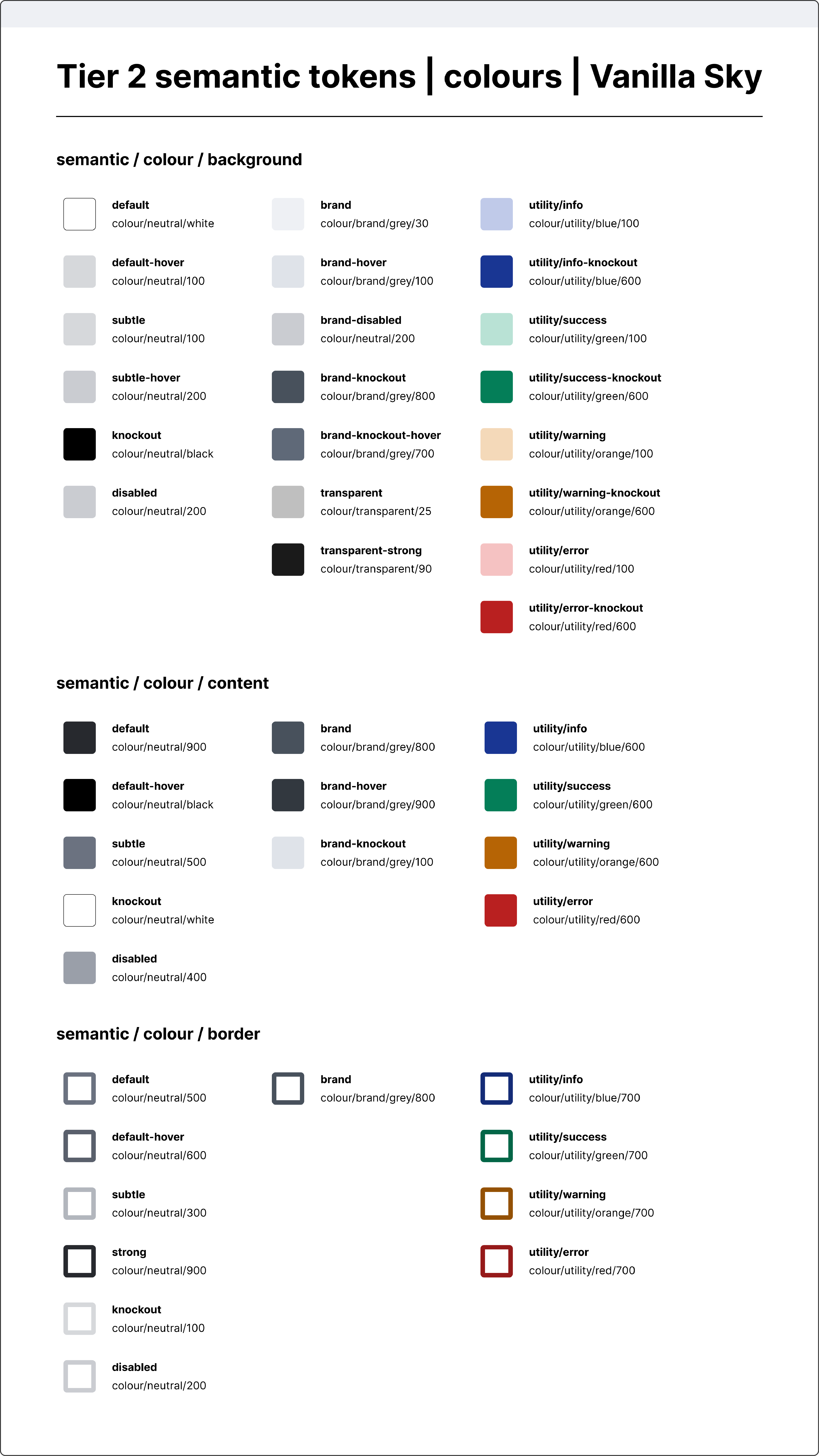
↑ Tier 2 semantic tokens: colours for the Vanilla Sky theme
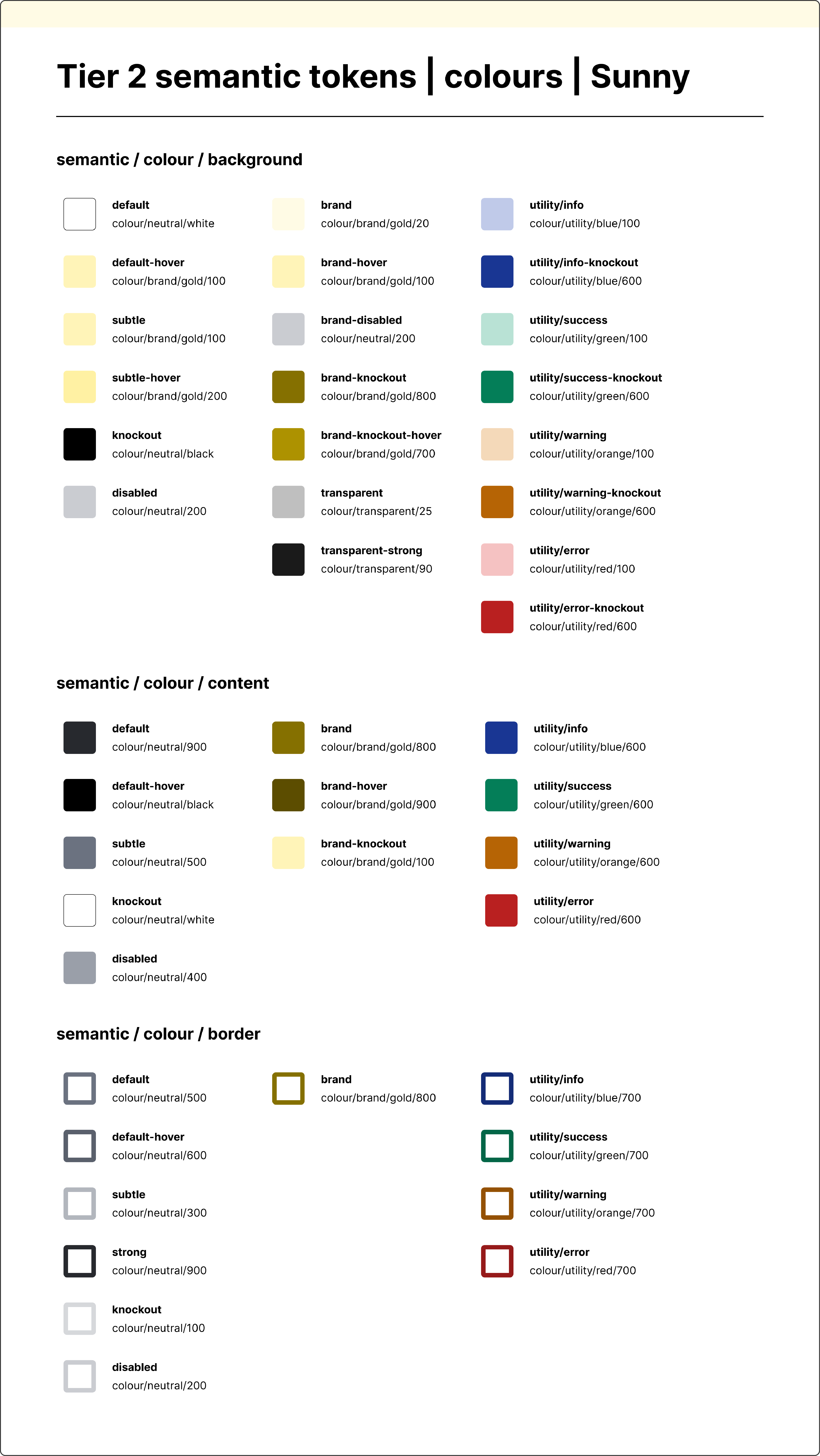
↑ Tier 2 semantic tokens: colours for the Sunny theme
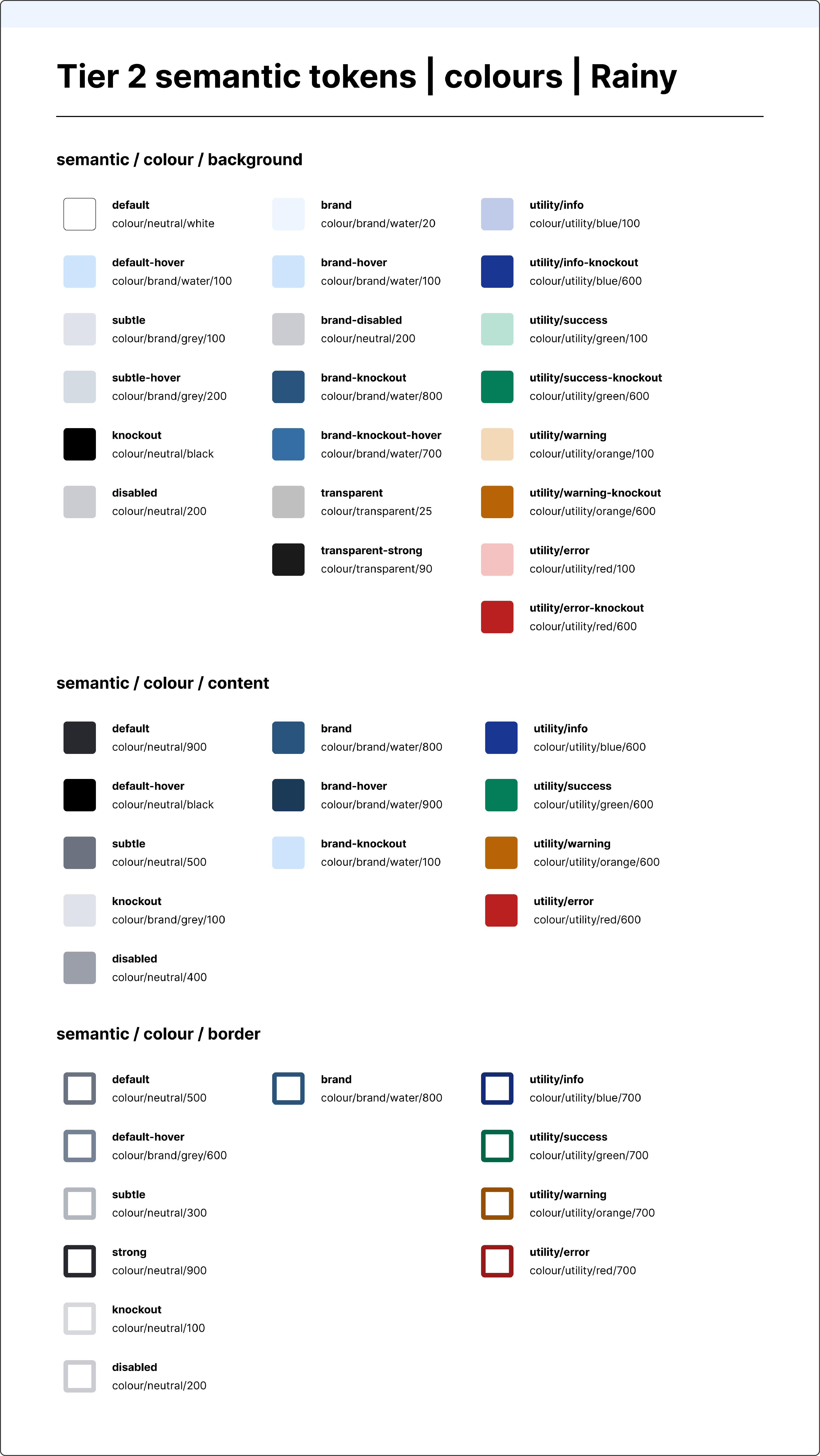
↑ Tier 2 semantic tokens: colours for the Rainy theme
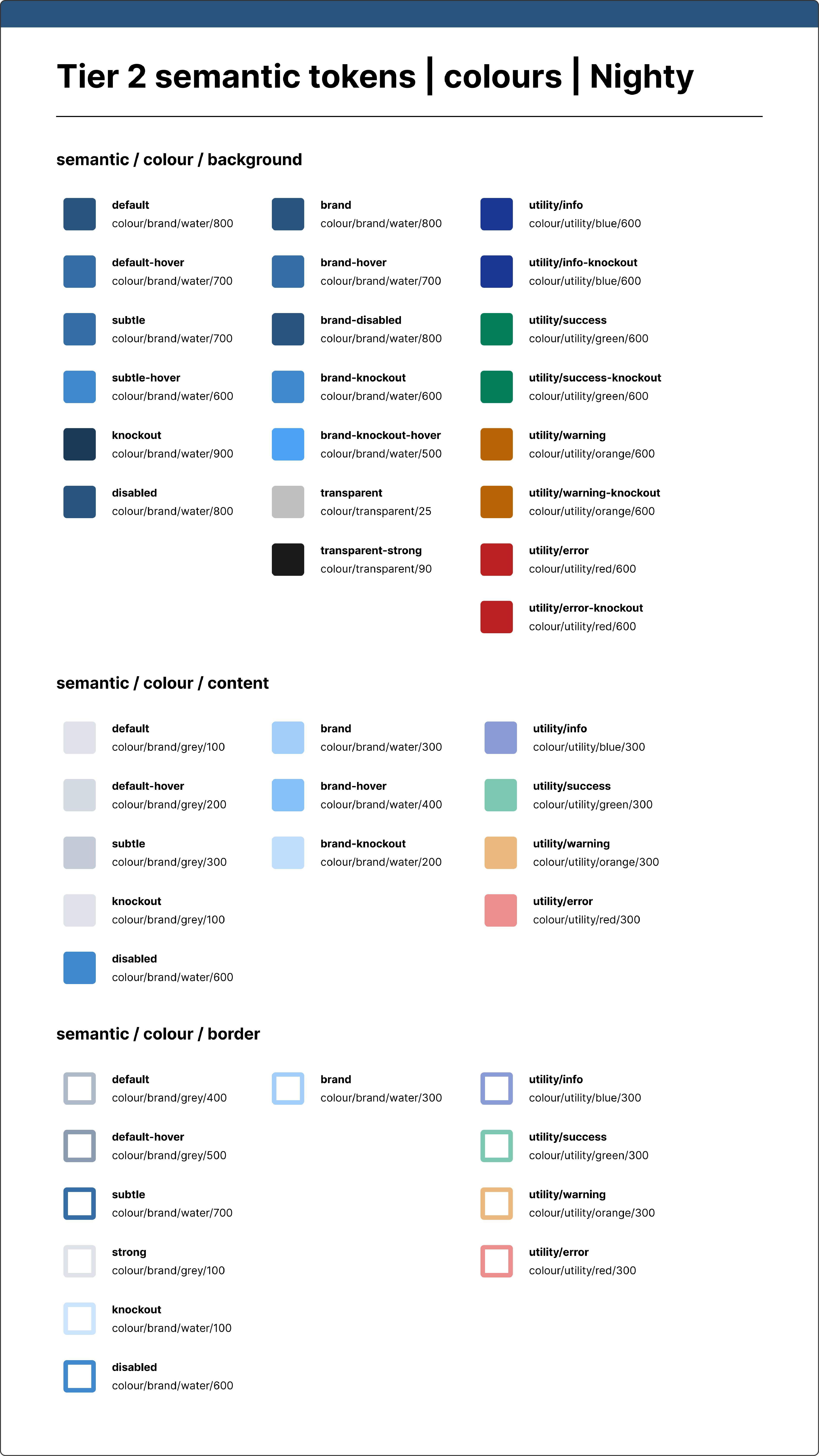
↑ Tier 2 semantic tokens: colours for the Nighty theme
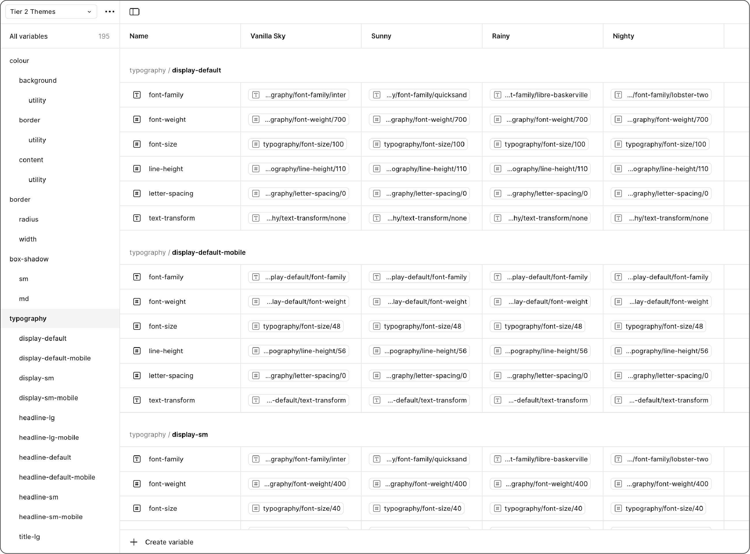
↑ Tier 2 semantic tokens: typography
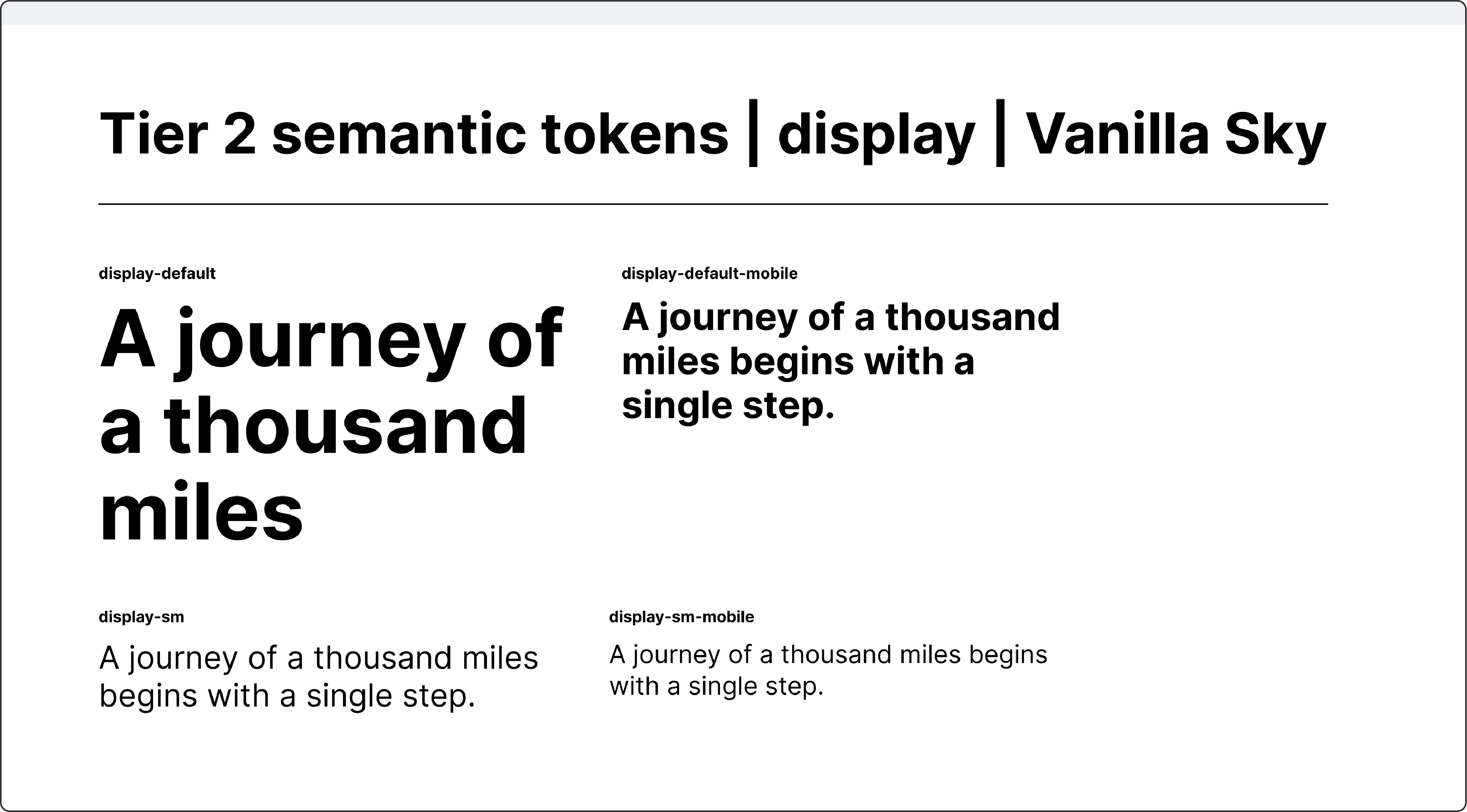
↑ Tier 2 semantic tokens for display typography in the Vanilla Sky theme
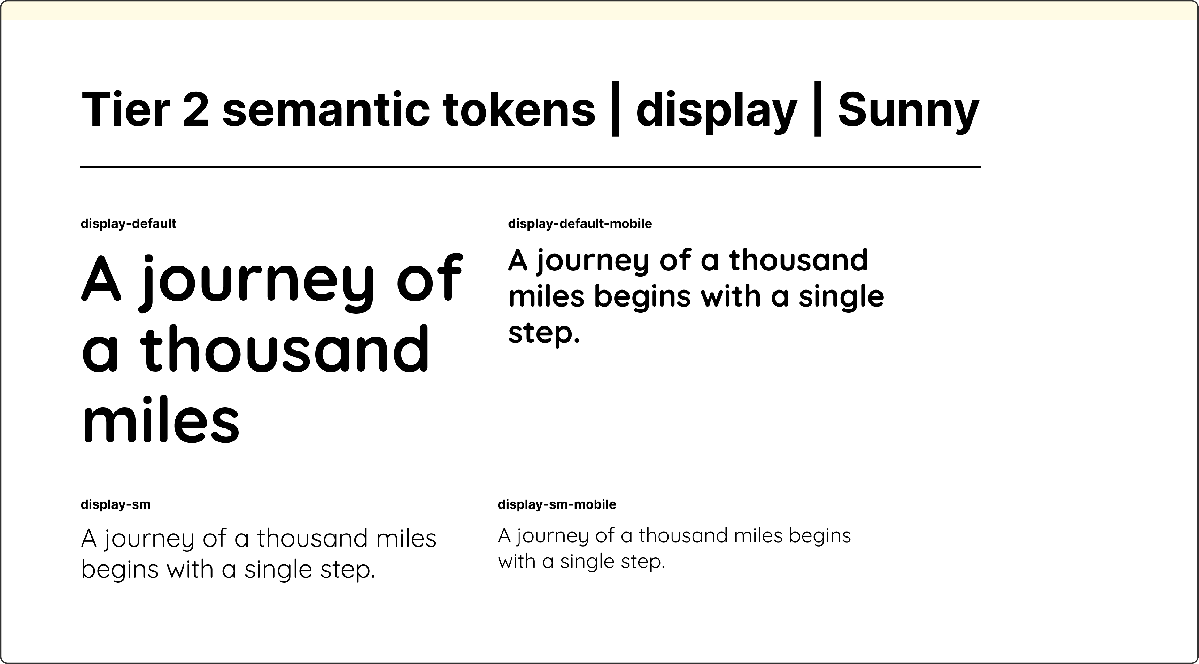
↑ Tier 2 semantic tokens for display typography in the Sunny theme
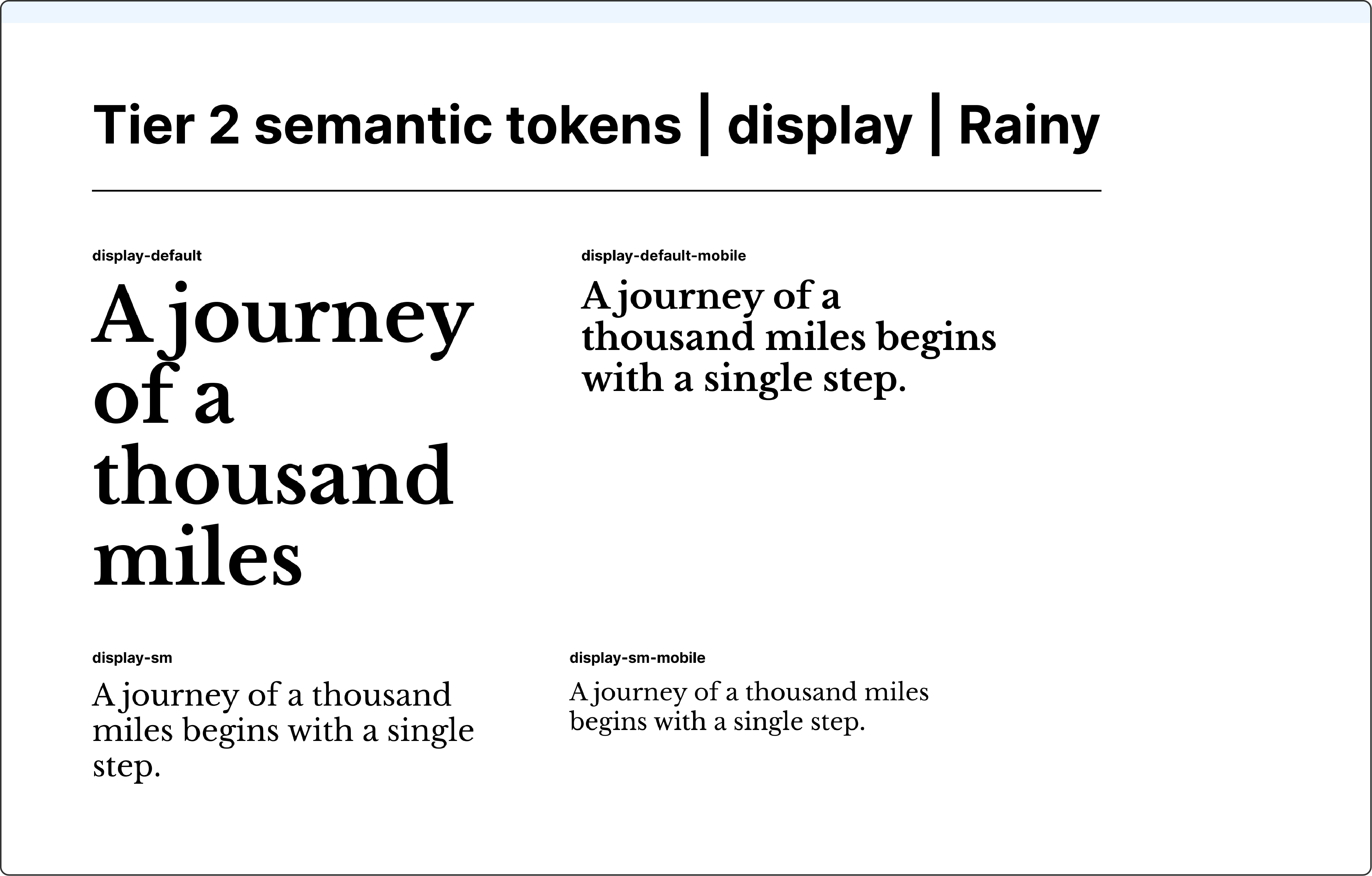
↑ Tier 2 semantic tokens for display typography in the Rainy theme
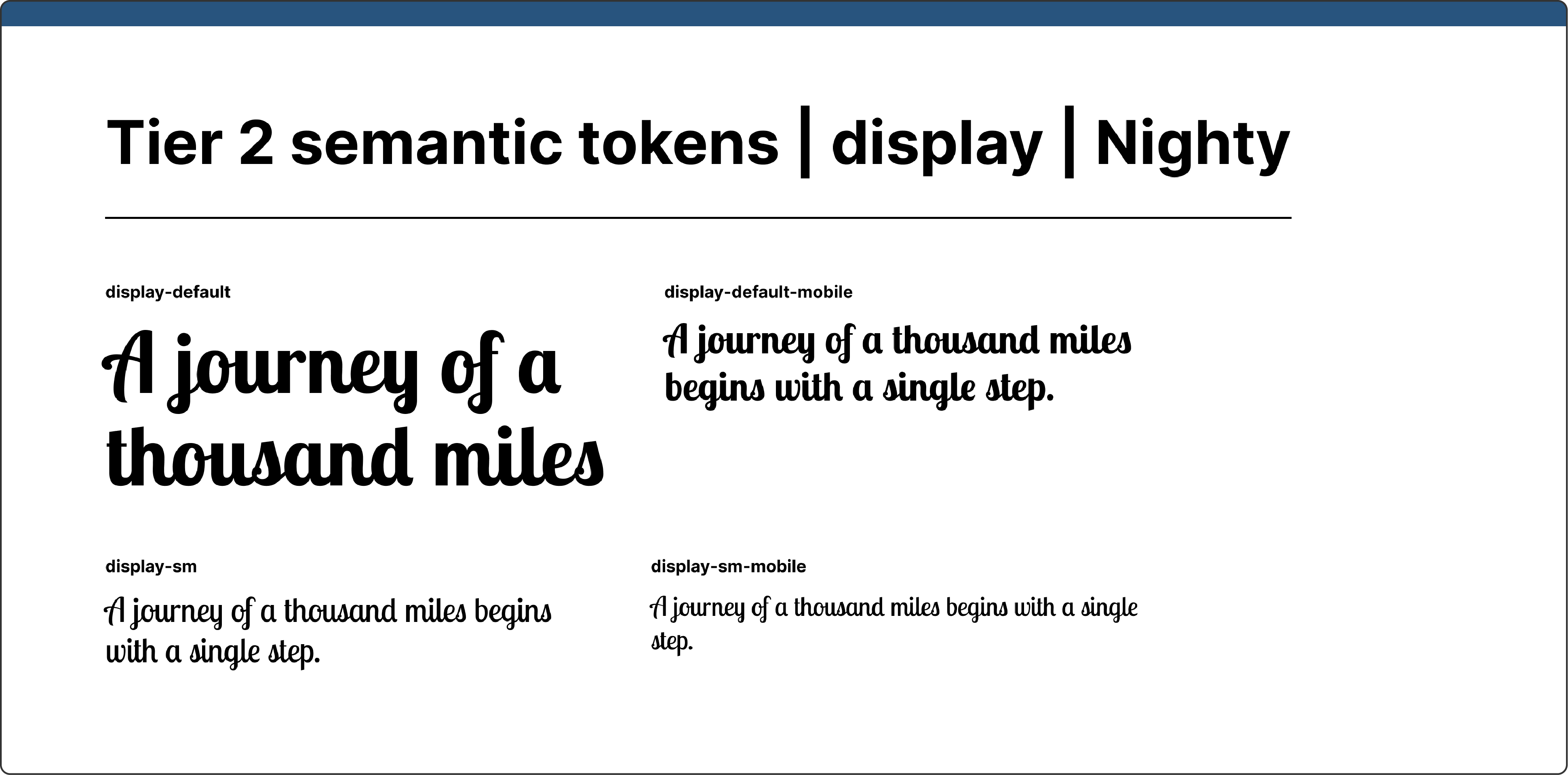
↑ Tier 2 semantic tokens for display typography in the Nighty theme
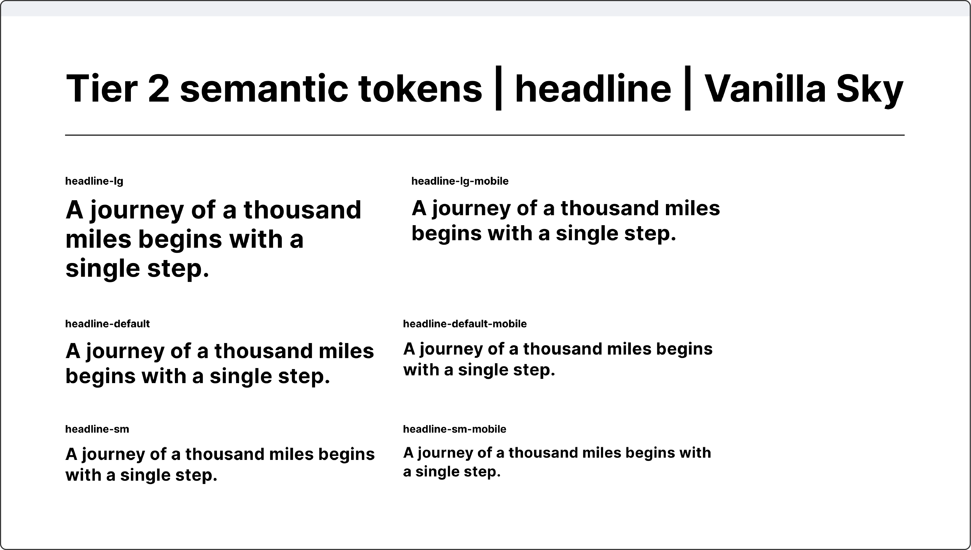
↑ Tier 2 semantic tokens for headline typography in the Vanilla Sky theme
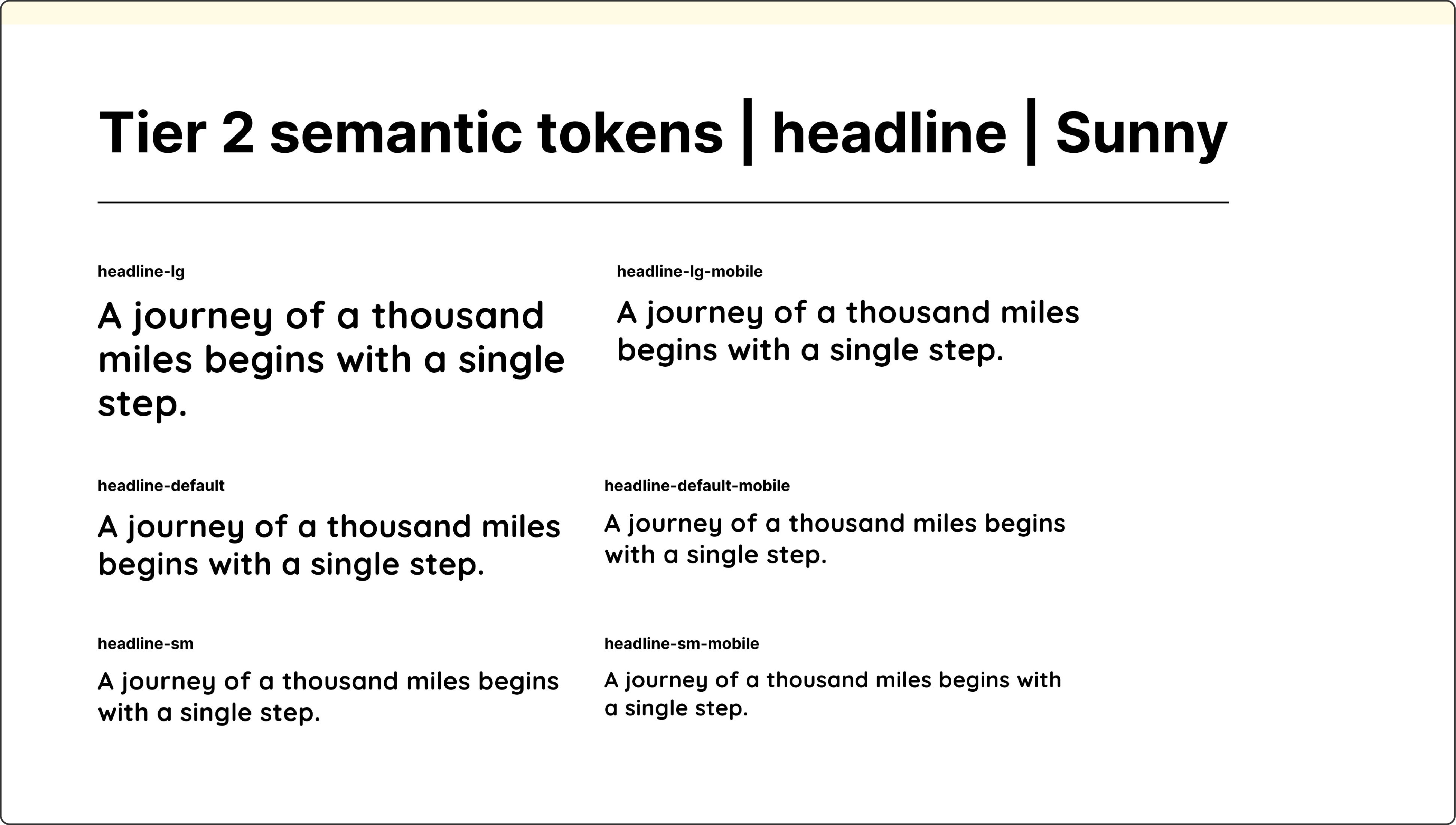
↑ Tier 2 semantic tokens for headline typography in the Sunny theme
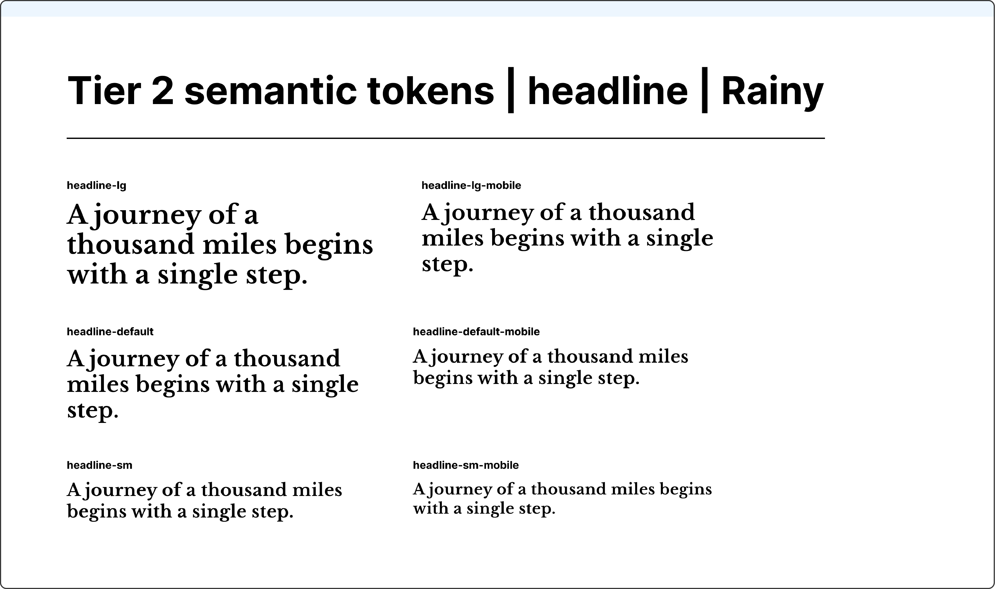
↑Tier 2 semantic tokens for headline typography in the Rainy theme
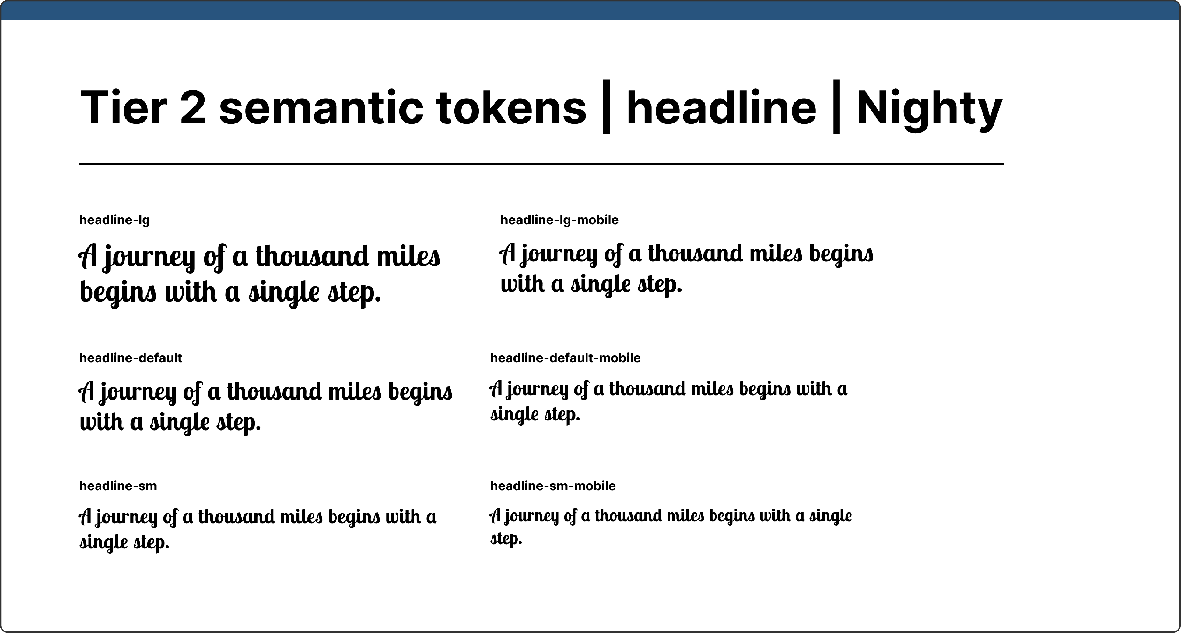
↑ Tier 2 semantic tokens for headline typography in the Nighty theme
These tokens contain component-specific styles for buttons, focus rings, forms, links, and hero graphics. Since I used Tier 1 colours to create unique hero graphics for each theme, I added a dedicated hero graphic group here.
↑ Tier 3 component-specific tokens
The core breakpoints collection handles three screen sizes: large, medium, and small. To make typography update automatically across different screen sizes in Figma, I added a separate typography styles collection.
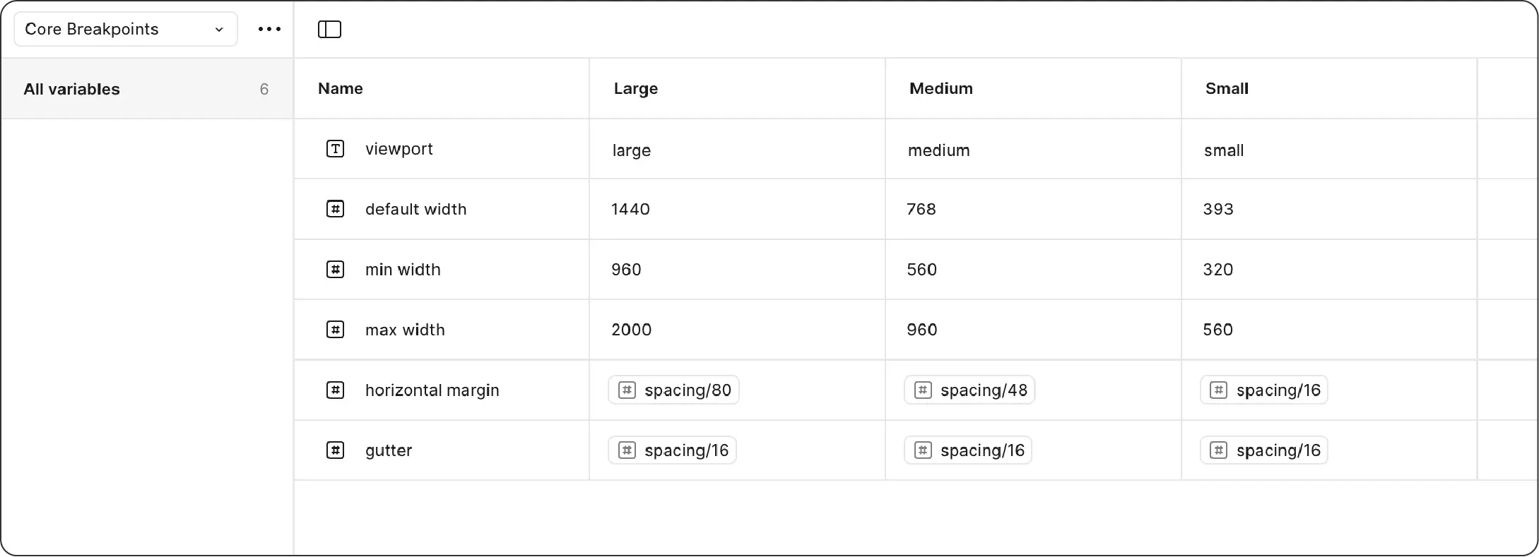
↑ Extra tokens for core breakpoints
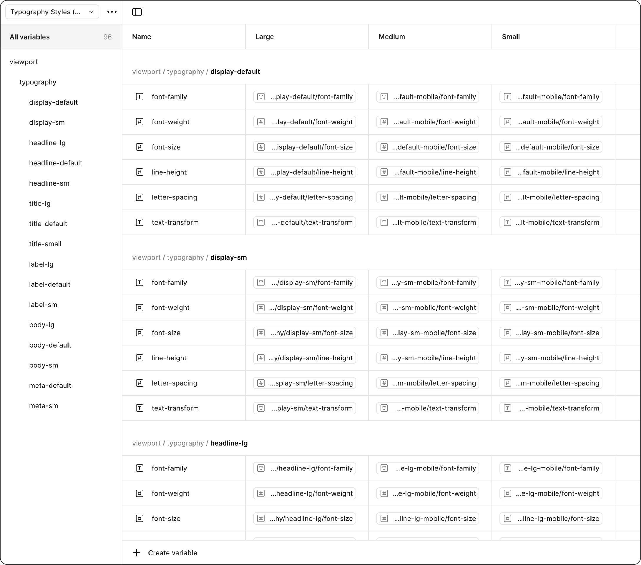
↑ Extra tokens for typography styles
In this design token system, each mode expresses its own unique personality through specific fonts, colours, and hero graphics. I created two sample pages to test how everything worked together and fine-tuned the tokens wherever needed.
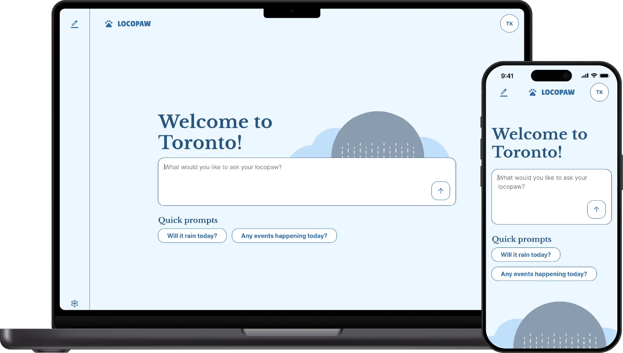
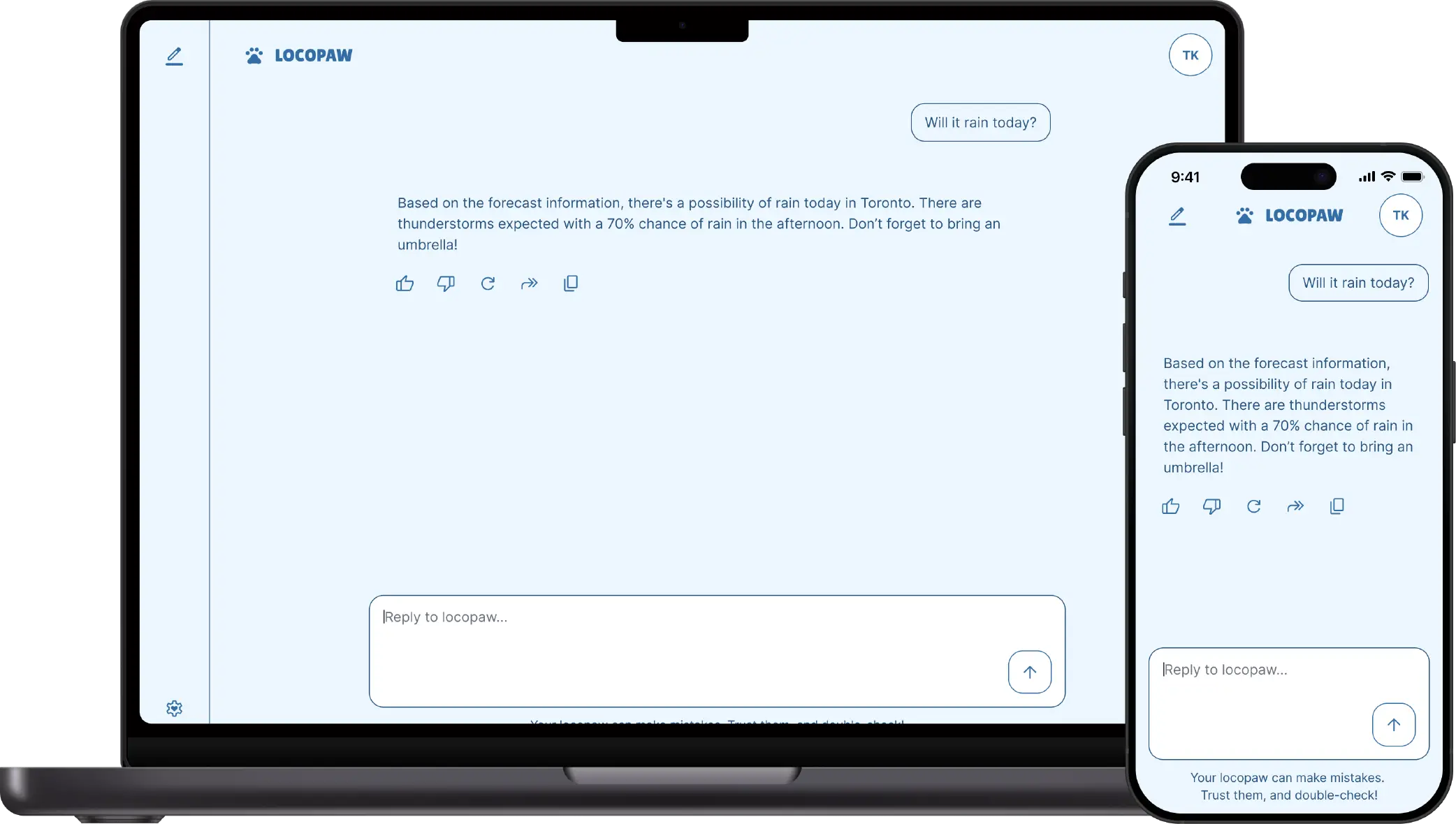
Vanilla Sky is the default theme—basically a cloudy, neutral starting point. Since it’s the default, I wanted to keep everything simple. I chose Inter as the typography because it’s clean and highly readable, paired with grey as the main colour to maintain that neutral feel. The hero image is equally simple: just a fluffy cloud made from four circles overlapping each other.
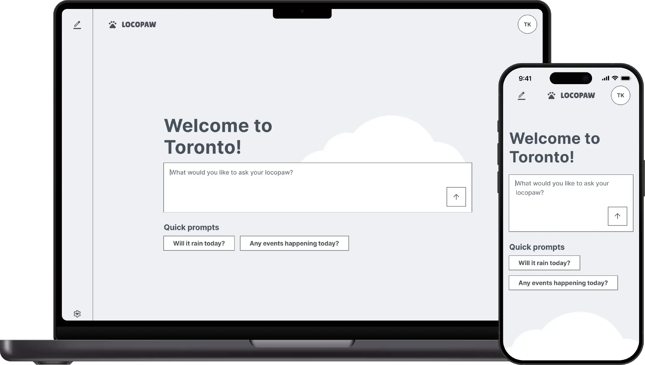
↑ Homepage mockup: Vanilla Sky theme
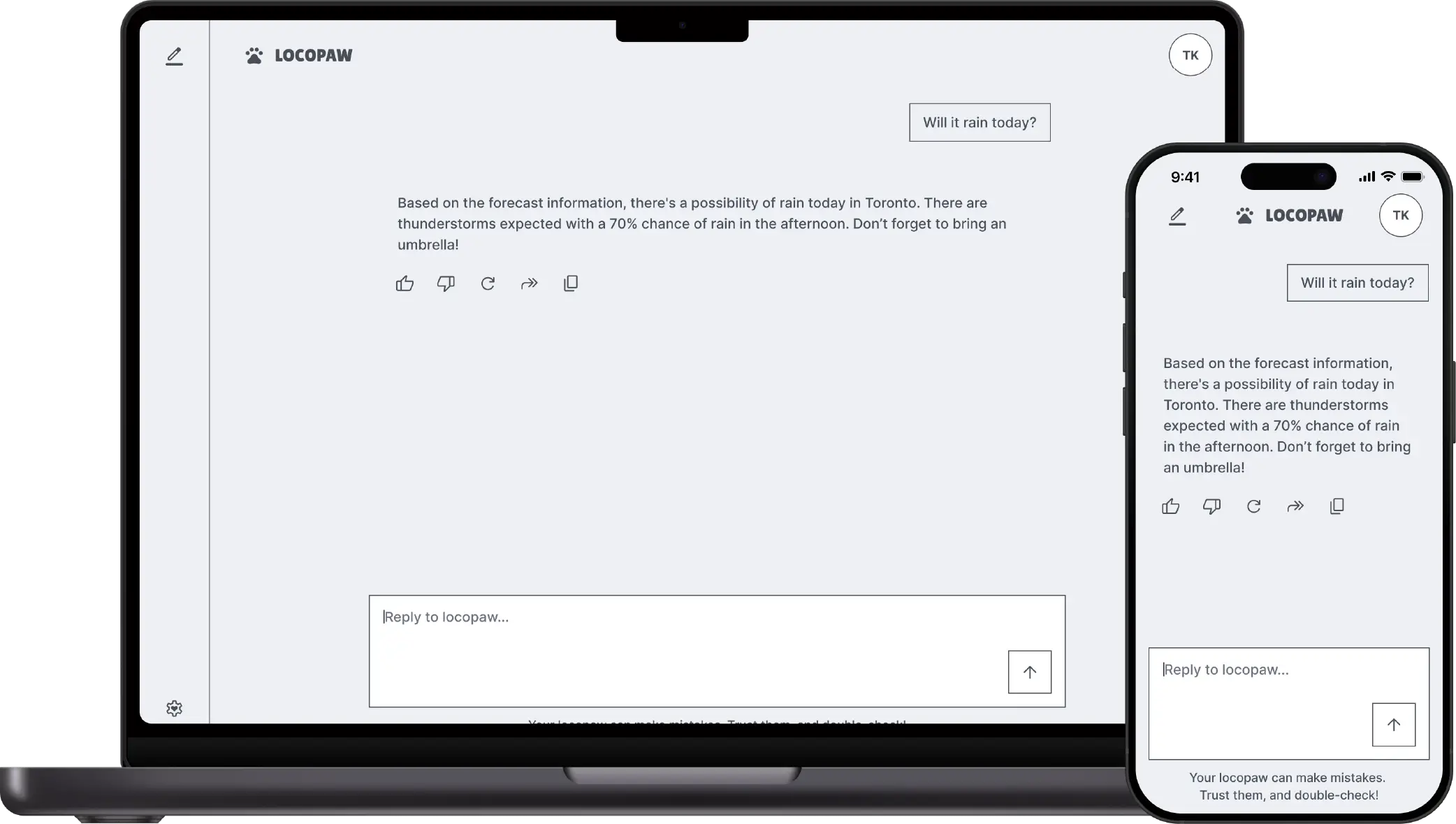
↑ Chat page mockup: Vanilla Sky theme
The Sunny theme is all about positivity and playfulness. I picked Quicksand as the primary typography to create an approachable and friendly vibe—its rounded letterforms naturally convey warmth and accessibility. For the colour palette, I used gold and orange to capture that sunny feeling and represent the warmth of sunlight. I also increased the border radius throughout this theme to make everything feel softer and more welcoming. The hero image features a cheerful, warm sun that ties the whole sunny concept together.
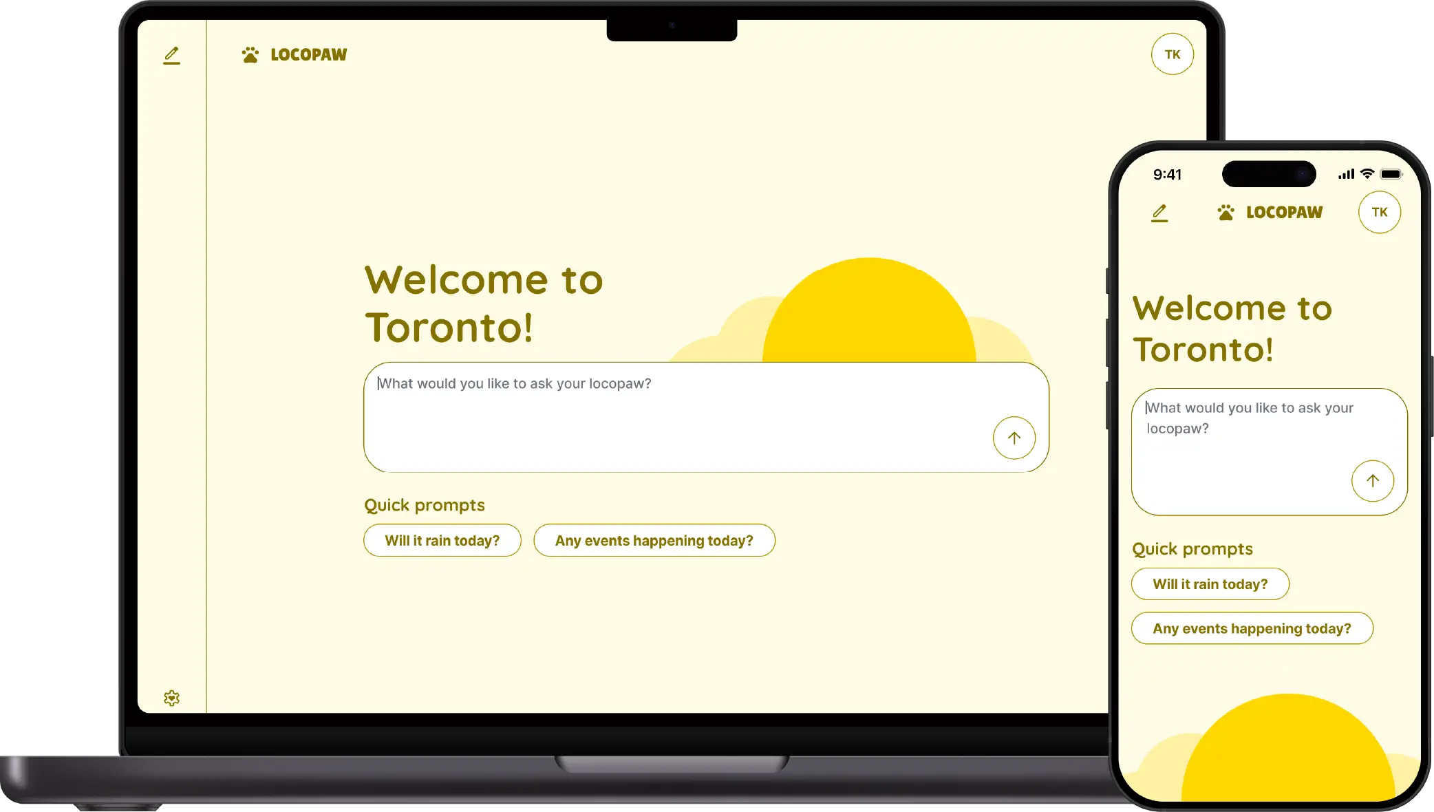
↑ Homepage mockup: Sunny theme
↑ Chat page mockup: Sunny theme
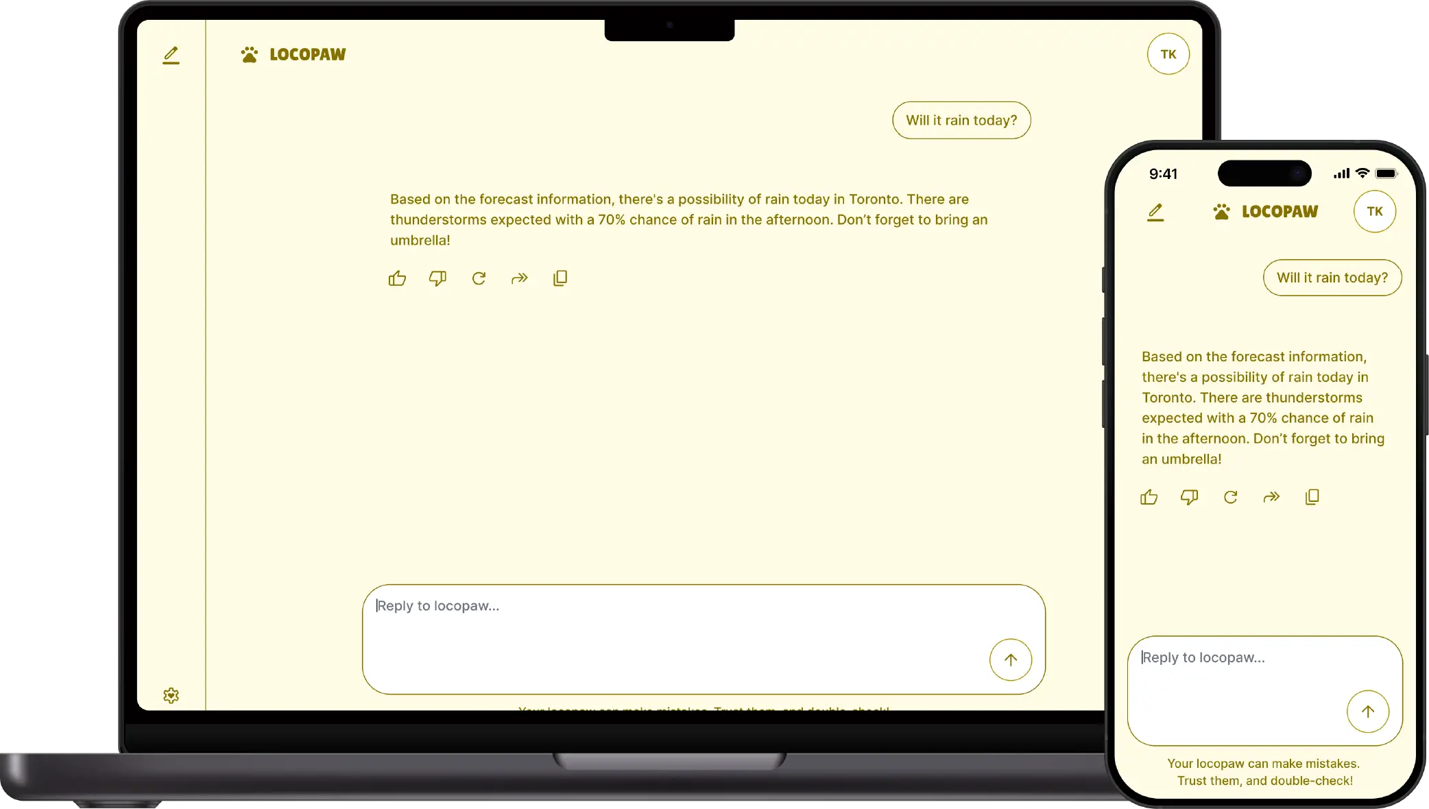
For the Rainy theme, I chose Libre Baskerville as the primary typography to convey the elegance and sophistication of a rainy day. There’s something graceful about rain that needs a more refined typeface. The colour palette uses blue to represent rain and grey for those darker storm clouds. I added delicate raindrops to the hero image to make the connection to the theme clearer.
↑ Homepage mockup: Rainy theme
↑ Chat page mockup: Rainy theme
Nighty serves as the dark mode for this token system. I selected Lobster Two as the theme typography because it delivers a sense of creativity, playfulness, and charm—just like the night sky filled with millions of stars and endless possibilities. The colour palette combines blue and grey to represent the night sky, with gold accents for stars and moonlight. To add some fun and appeal, I included a sleepy cat in the hero image, which captures that cozy nighttime feeling.
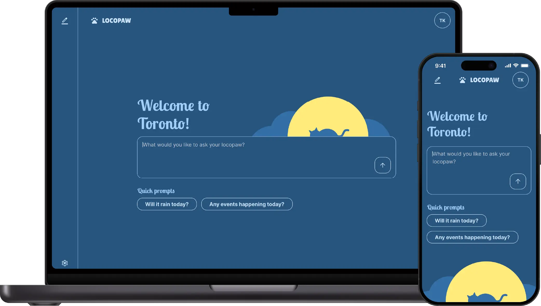
↑ Homepage mockup: Nighty theme
↑ Chat page mockup: Nighty theme
Since both pages I created for this project feature lots of buttons, I also created some button components to maintain consistency: a regular button and an icon-only button. These components ensure that no matter which theme is active, the buttons always feel cohesive with the overall design.
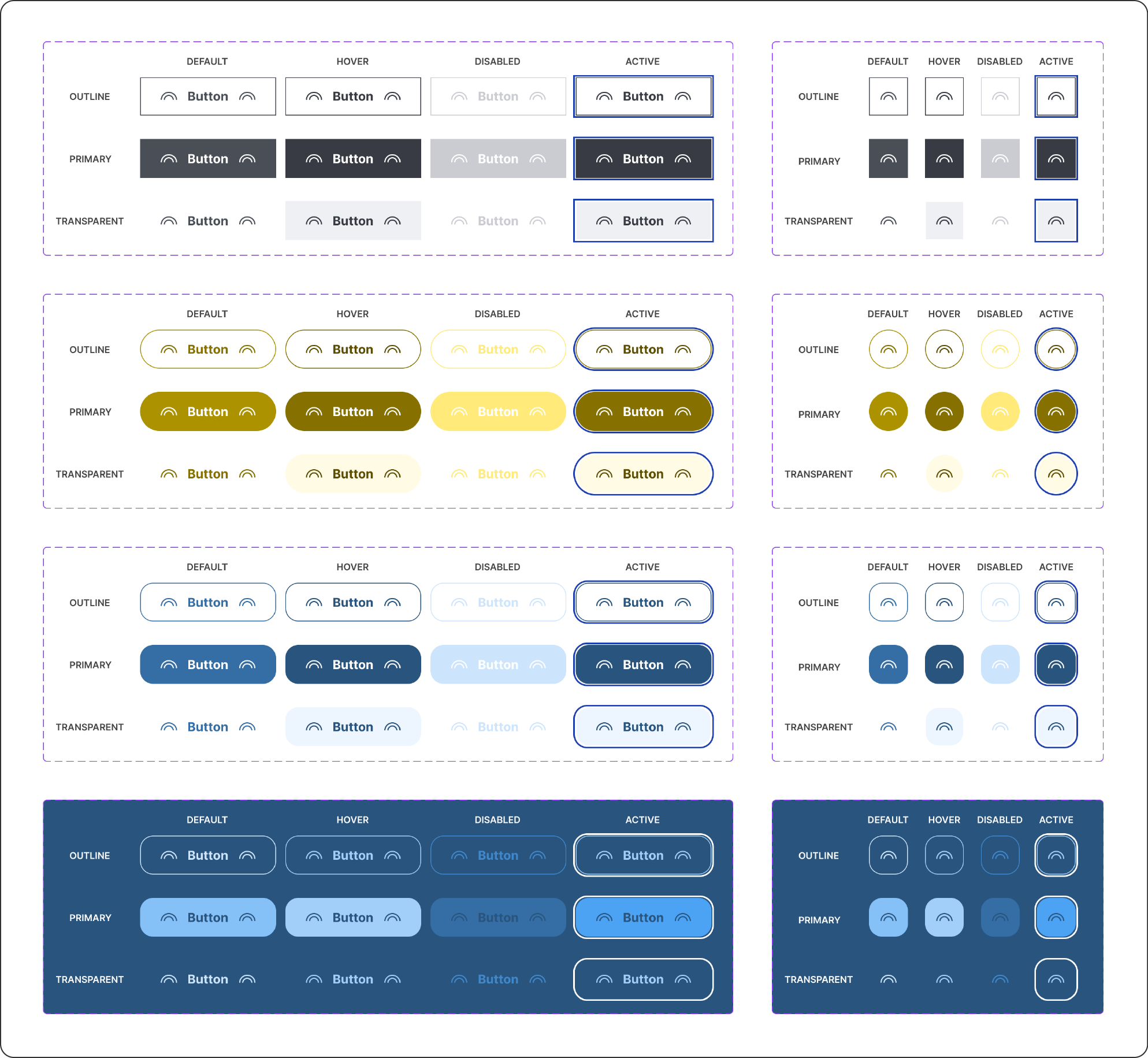
↑ Button components
↑ Design token system theme switching
Even with course materials to guide me, building my first design token system came with its learning curve. I sometimes connected variables incorrectly—like linking a Sunny theme element to a Rainy theme token instead. While time-consuming to fix, these mistakes taught me a lot about how the system works.
Creating hero graphics that looked great across all themes using colour tokens was tricky, too. I had to find a silhouette that worked well in every theme, then apply the tokens carefully to achieve the look I wanted.
Making sure all colour combinations met accessibility contrast requirements was another challenge. I expected this issue going in, but it still took several rounds of adjustments to get everything right.
Building a solid design token system takes time, but it’s absolutely worth it. We often want to speed up the design process and skip this foundational work because it seems more efficient in the short term. However, skipping it creates more work later and makes it much harder to keep the product looking cohesive.
Naming conventions matter since design token systems are meant for team use. They help keep everything consistent, clear, and practical so developers and other team members can easily understand and implement them. For example, using descriptive names like “button-colour-background” instead of “blue-700” helps everyone understand the purpose behind each token.
Finally, a good design token system should grow and evolve over time. It needs regular updates and maintenance—treat it as an ongoing project, not a one-time task.
I almost called this project "Local Snake" instead of Locopaw. Back home, we have a term “地頭蛇 (dìtóushé)” which means local snake in English—it refers to someone who knows a place really well. I switched to Locopaw after thinking about those adorable cats in Houtong, and it sounds much more friendly and approachable.
After building this design token system and seeing it in action, I’m amazed by how powerful it is—and how much tweaking it needs to become even better. I want to create more components using this system, continue refining it, and have more fun experimenting with it. I’m also excited to take more design system courses and keep building my skills in this area.


